Information
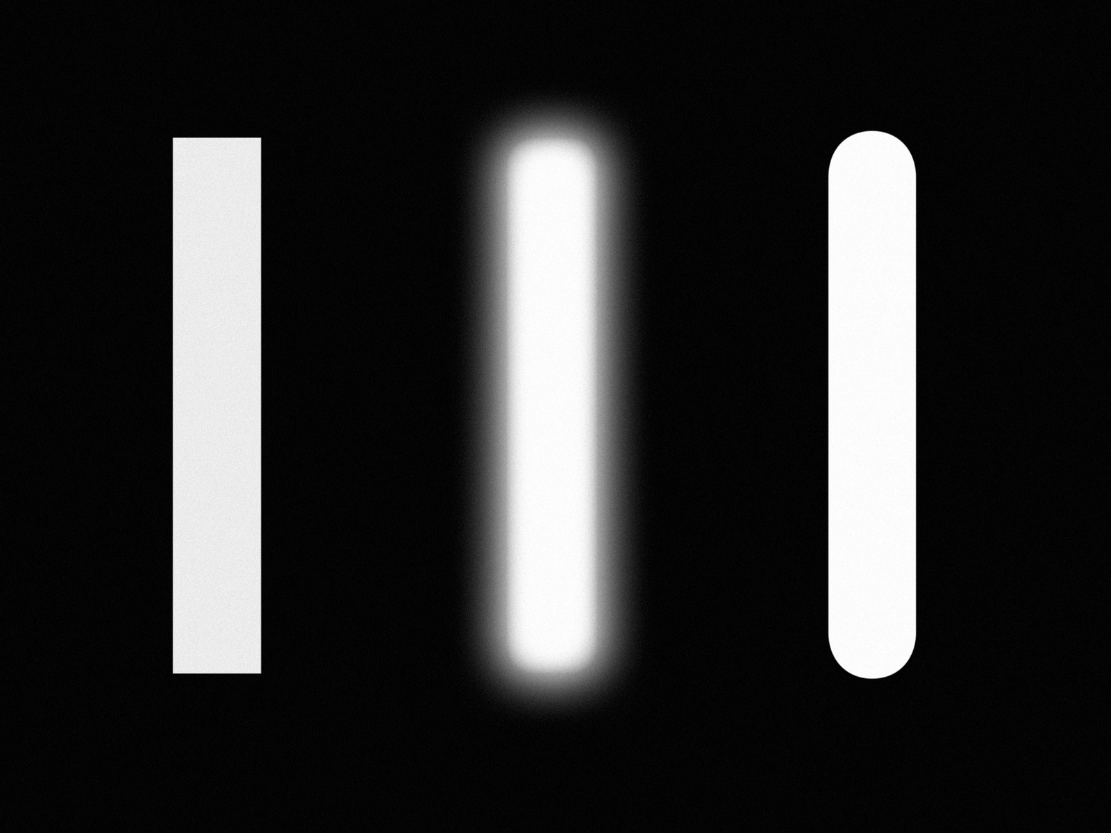
The history of rounded type is strange and diverse, from baked bread letterforms to bubbly corporate tech logos. While today rounded type might be a stylistic genre, it’s interesting to understand its evolution as a product of technological or production constraints. Take, for example, wood type where it was easier to mill curved forms as opposed to right angles. Or highway signage, where text would appear blurred from backlighting, making words look different in the day versus the night.
The latter was a consideration for Karl Gerstner in 1964 as a part of a proposed identity for Shell, where the logo is most often seen while driving. Gerstner, together with his agency GGK, proposed a rounded Sans Serif font to reference the viscosity of oil and simulate the effect of light projected through a sign. Unfortunately, the pitch was “received with applause, and rejected with regret” and the typefaces was subsequently shelved in the archives.
Nearly 50 years later, Laurenz Brunner discovered the project during an apprenticeship at GGK and committed to expand on Gerstner’s original pioneering concept. The result is the aptly titled typeface “Karl,” which acts as a homage to its namesake, moving beyond the original cut into a full family of different weights including a monospace and a phatty.
Designer: Laurenz Brunner
Available Cuts
- Regular
- Medium
- Bold
- Black
- Ultra
Source Material
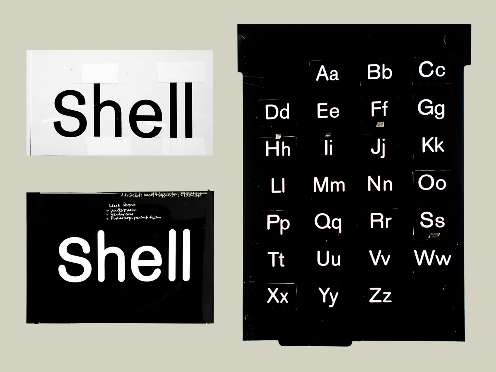
Unused typeface sketch for Shell by GGK (1964)
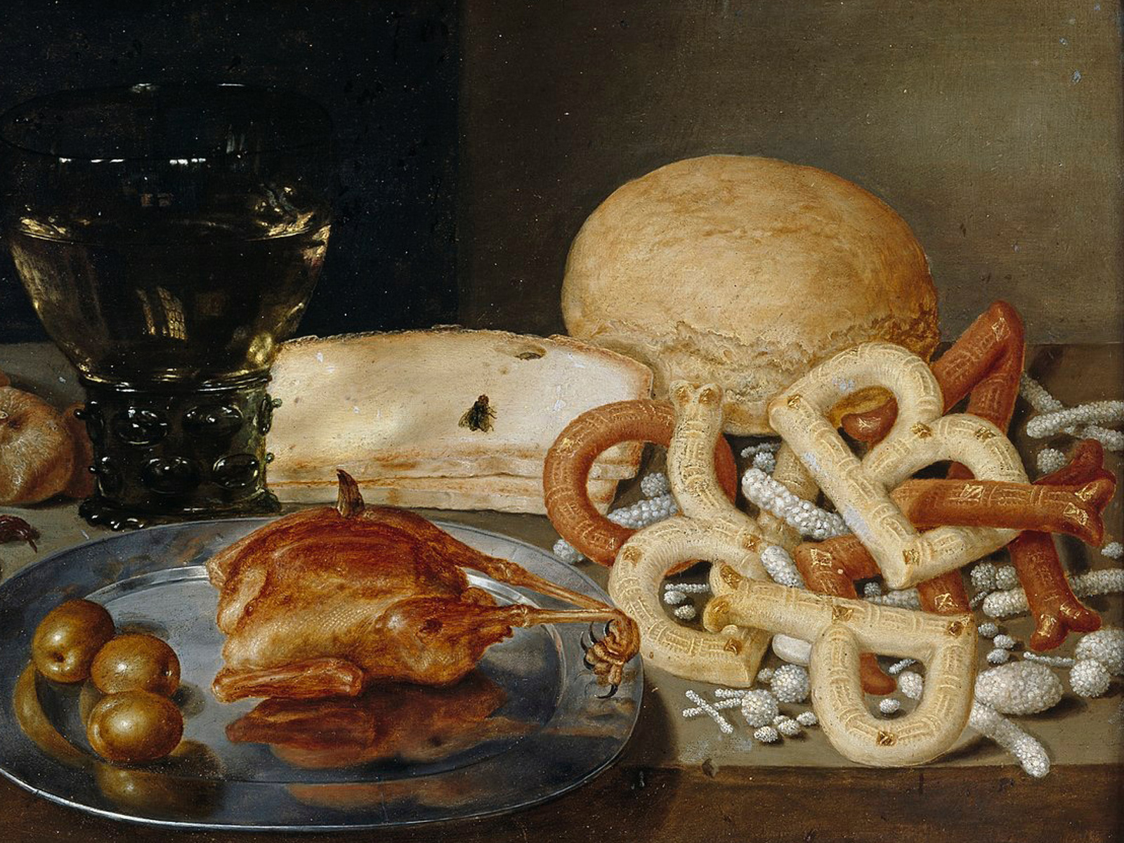
The first example of sans-serif letterforms according to Gerard Unger. Peter Binoit, Stil-life with letter pastry (1615)
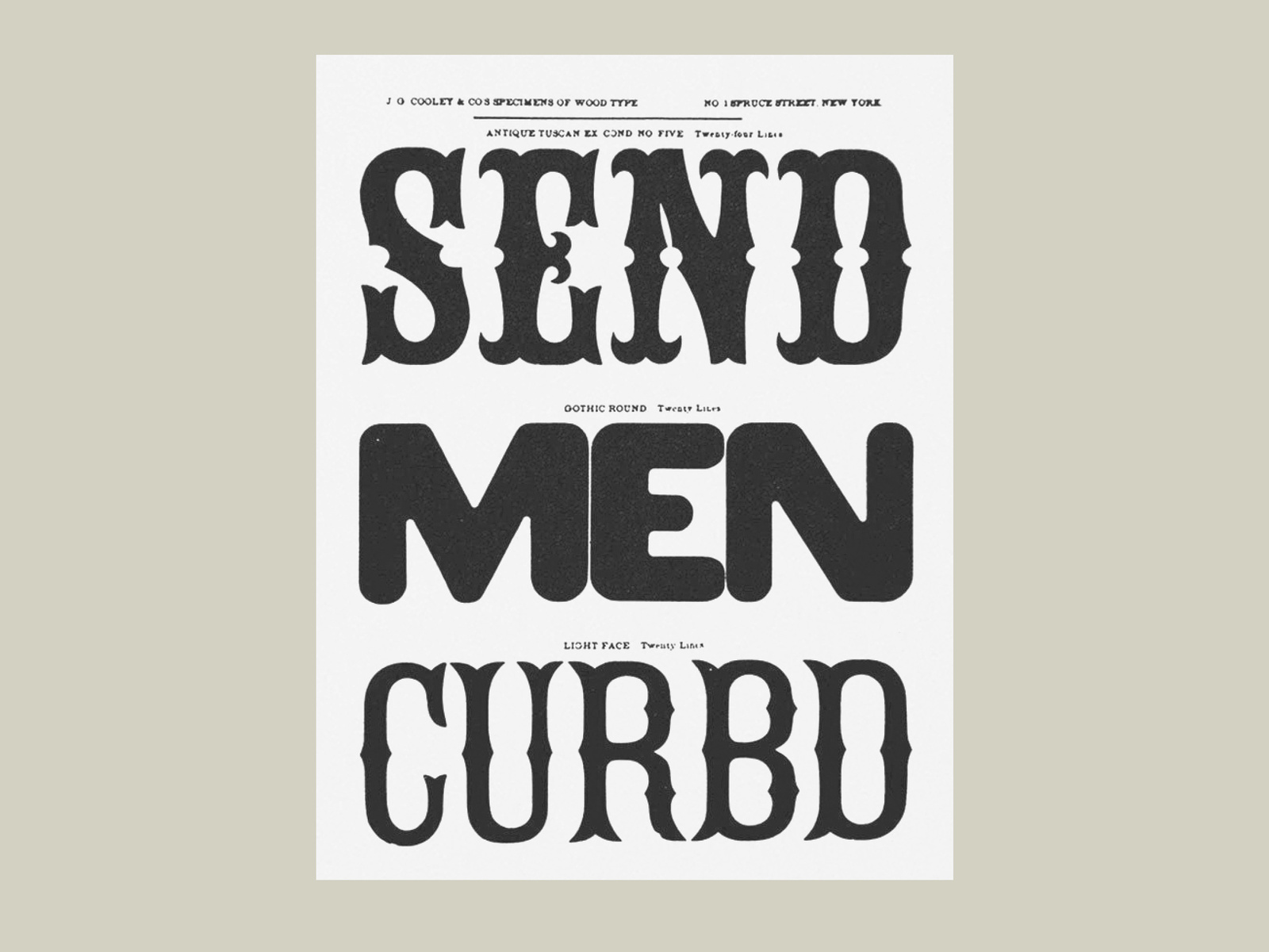
One of the oldest known examples of a rounded font. Gothic Rounded, John G. Cooley (1859)

Since the early 1900s lettering stencils have been used in the drafting process to improve consistency and efficiency (1900s–present)
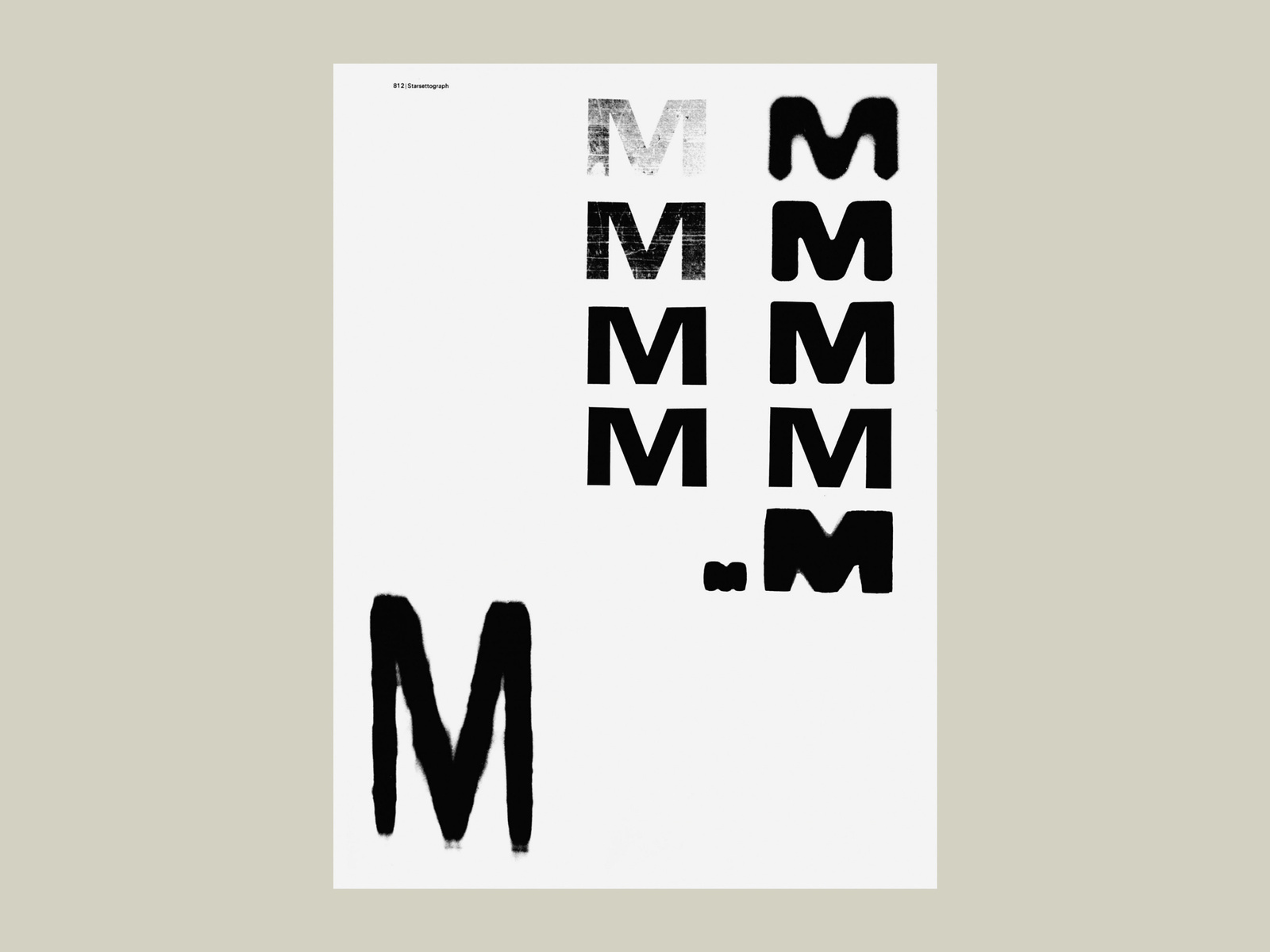
Experiments by Robert Büchler utilizing an out of focus phototypesetting process to create rounded letterforms (1966)
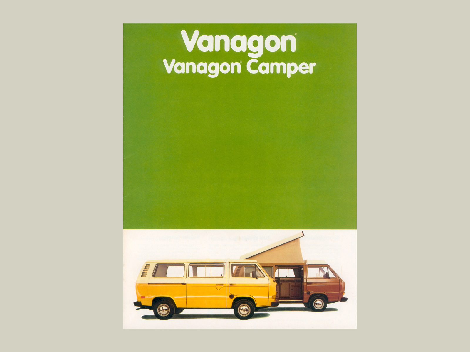
GGK designs VAG Rounded for Volkswagen (c. 1970)
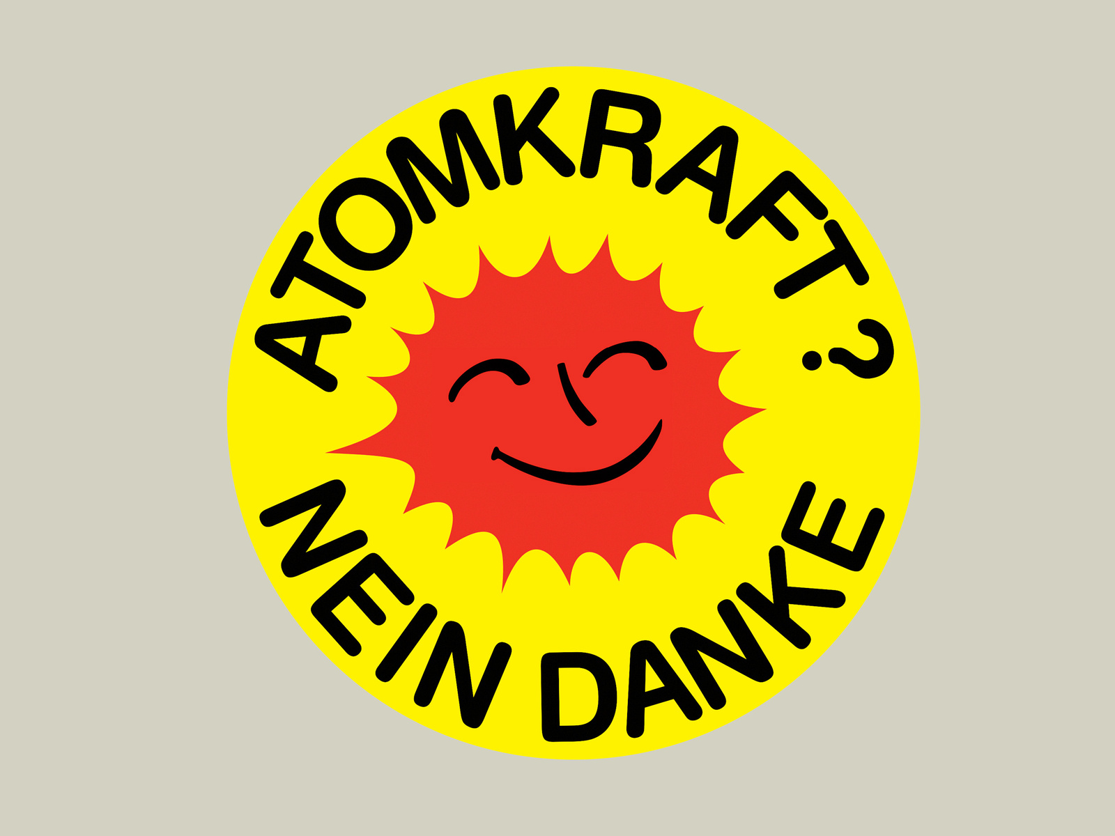
“Friendly enough to be worn, firm enough to say no thanks.” Anti-nuclear Smiling Sun, Anne Lund (1975)
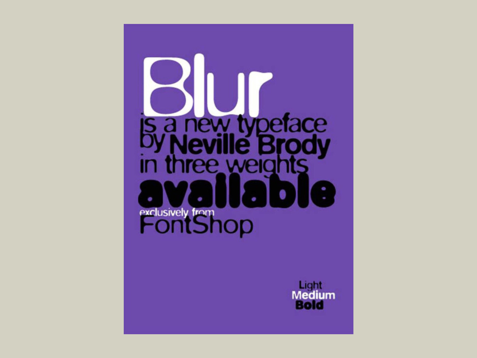
The soft-focus letterforms of FF Blur mimic the degenerative effect of copying and recopying on a low-quality Xerox machine. FF Blur, Neville Brody (1992)
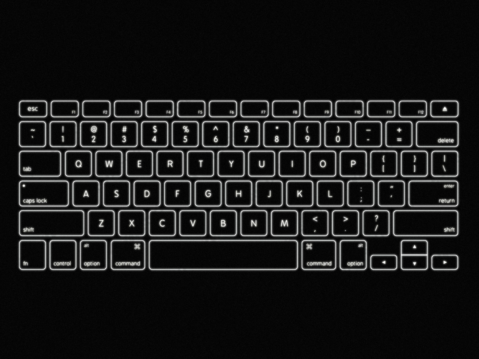
VAG Rounded used on Apple keyboards to compensate for backlight blur (1999–2015)
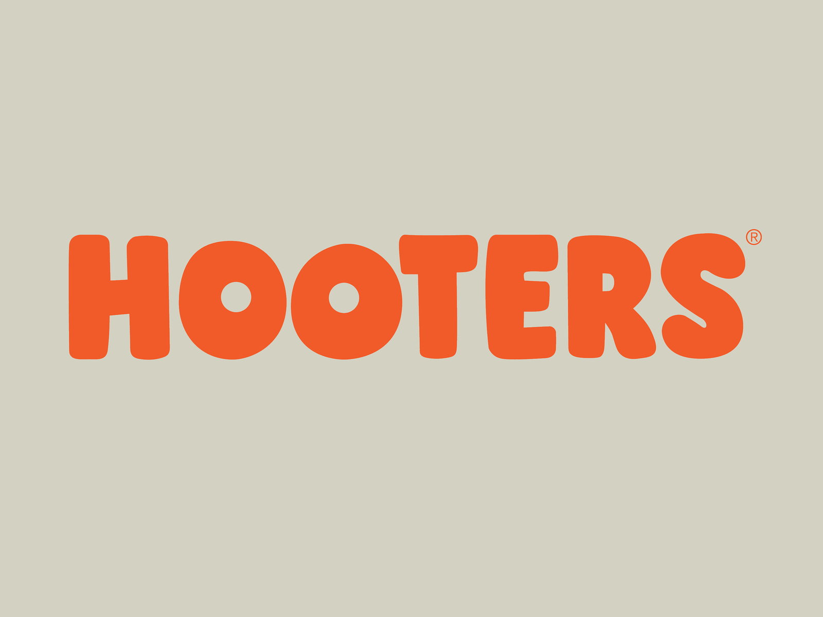
In 1983 Hooters creates its infamous logo, later that year the company was officially incorporated on April Fool’s Day (1983–present)
Specimen
Typetester
Glyphs Overview
Letters
Figures
Latin Supplement and Extension
Discretionary Ligatures
Stylistic Sets
Punctuation and Symbols
Case Sensitive Forms
Superscript and Subscript
Fractions and Ordinals
Currency and Mathematical Operators
Tabular Figures and Currency
Roman Numbers
Arrows
OpenType Features
Stylistic Sets
a Schoolbook
a Schoolbook
Discretionary Ligatures
Case Sensitive Forms
[SIC] (PARENTHESES) {A,B}
RE: SUBJECT KARL-MARX-STADT
« MERCI » ‹DANKE›
[SIC] (PARENTHESES) {A,B}
RE: SUBJECT KARL-MARX-STADT
« MERCI » ‹DANKE›
Contextual Alternates
Tabular Figures
111 CHF
111 CHF
Fractions
Superscript and Subscript
Information
Technical Data
Encoding:Latin Extended
File Formats:OTF, TTF, WOFF, WOFF2
Version:1.0
Download