About Reform
Laurenz Brunner first encountered a Reform Muli tractor in the Swiss mountainside in 2019. Affixed to the front of the vehicle was the company’s striking R logo, an alien looking character that stuck with Brunner in its awkward combination of milled curves and rural flavor. Looking deeper into the history of Reform opened up an entire ecosystem of agricultural graphics found in tractor manuals, farming equipment catalogs, and agronomical trade fair leaflets. Throughout the pages were bold graphics common in machine branding, offset by curved details referencing the natural shapes of agriculture. It was this balance between the technical and the organic, that formed the core of the Reform alphabet. After nearly five years of development, the typeface is available now in a family of 3 weights perfect for use in all terrains.
Available Styles
- Regular
- Medium
- Bold
Source Material

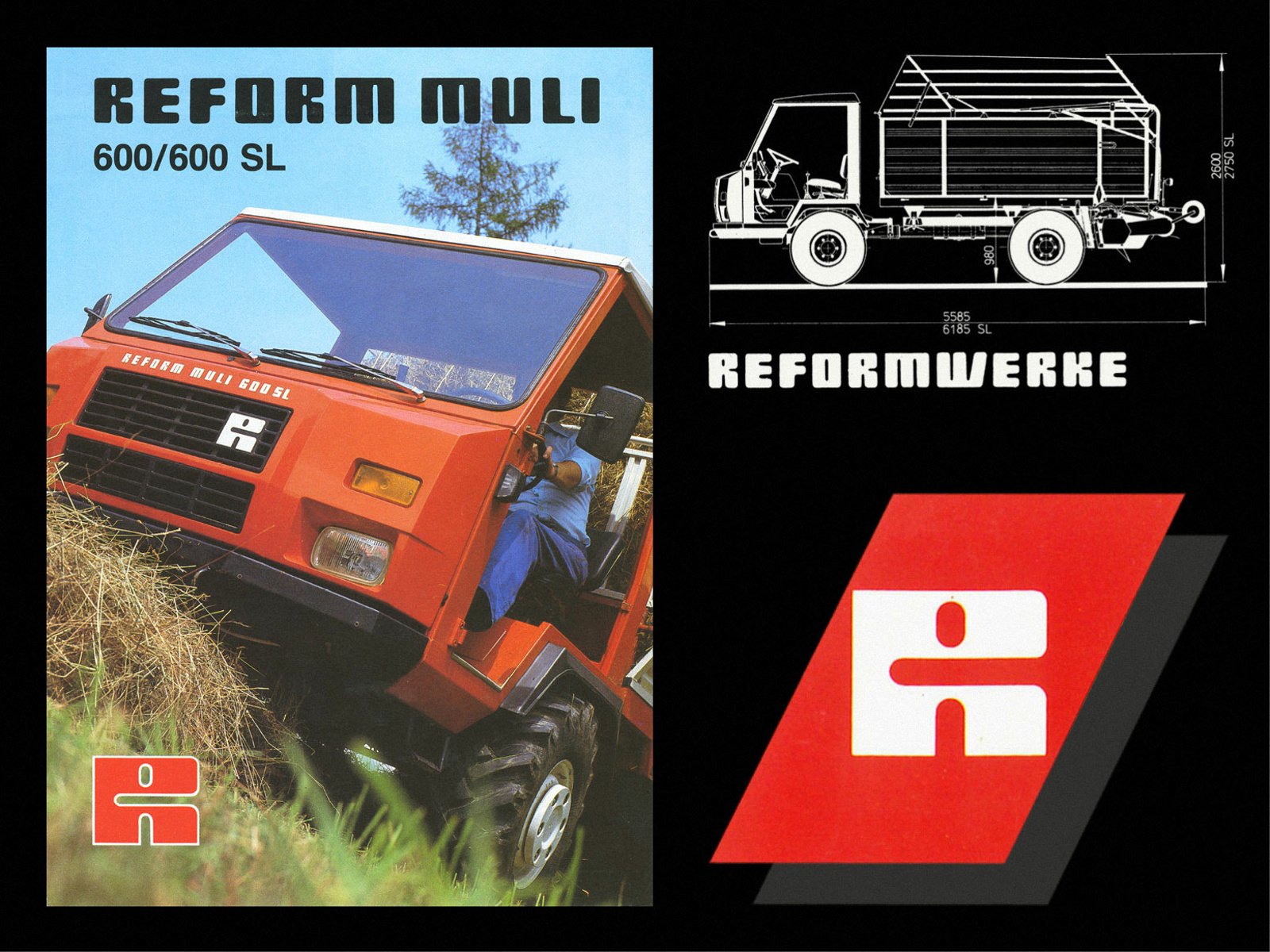
Branding elements for Reform, an Austrian manufacturer of agricultural vehicles
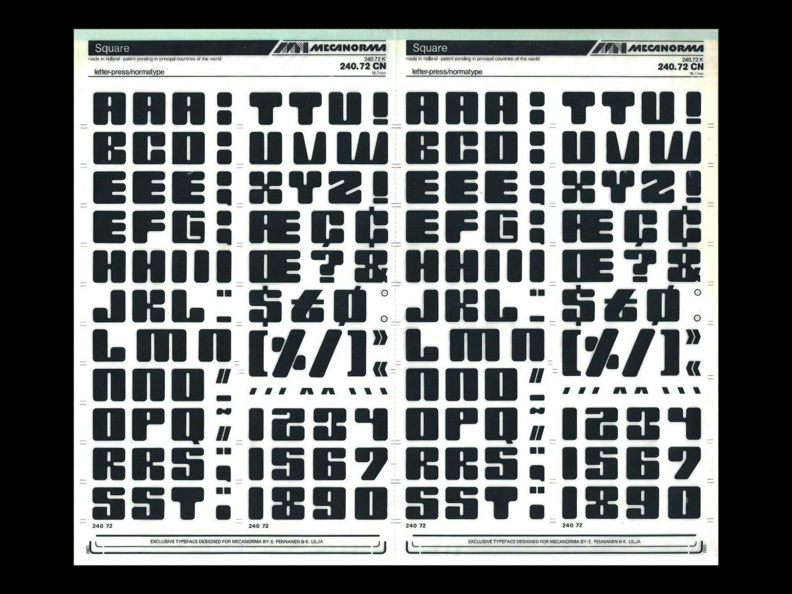
Mecanorma’s Square by Erkki Pennanen and Kari Lilja used for Reform’s logo (1972)
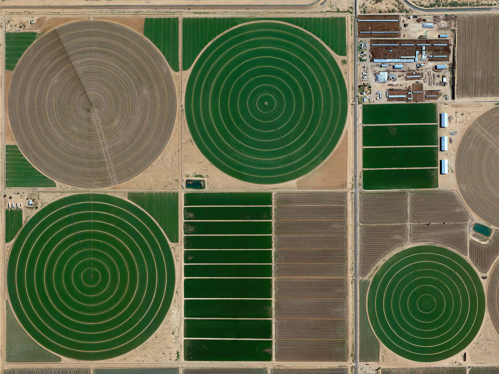
Center Pivot Irrigation, Arizona
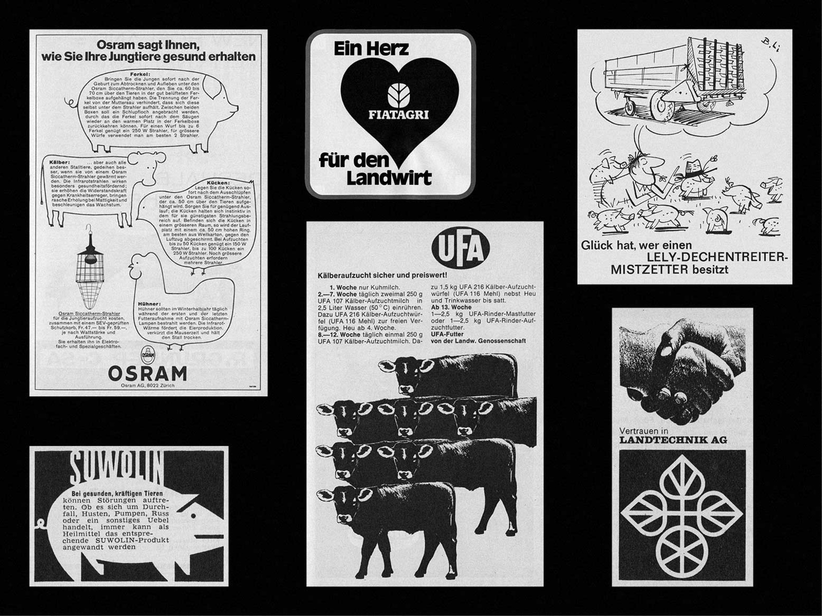
Ads found in “Die Grüne”, Swiss agricultural magazine (1967)

Hay baler sales catalogs (c. 1980)

Hay baler sales catalogs (c. 1980)

The Guinness World Record holder for widest horn span goes to Cowboy Tuff Chex with horns measuring 262.5 cm from tip to tip.

Crop circle discovered in Agloe, New York (2023)
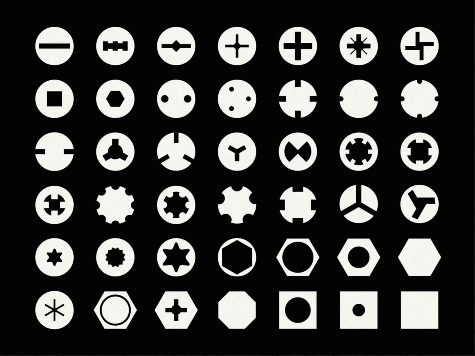
Screw head varieties

Largest pumpkin growin in the US weighing 2,365 pounds (2021)
Type Specimen
Special Features






Typetester
Glyphs Overview
Letters
Figures
Latin Supplement and Extension
Ligatures
Stylistic Sets
Punctuation and Symbols
Case Sensitive Forms
Tabular Figures
Fractions, Ordinals and Superscript
Currency and Mathematical Operators
Arrows
OpenType Features
Ligatures
Case Sensitive Forms
[SIC] (PARENTHESES) {A,B}
RE: SUBJECT YOU-PICK
« MERCI » ‹DANKE›
[SIC] (PARENTHESES) {A,B}
RE: SUBJECT YOU-PICK
« MERCI » ‹DANKE›
Contextual Alternates
Tabular Figures
111 CHF
111 CHF
Superscript
Ordinals
Information
Credits
ST Reform is designed by Laurenz Brunner in collaboration with Fabio Menet.
Design & Production Assistance: Selina Bernet
Font engineering and mastering: Wei Huang
First released by Source Type in 2023.
Technical Data
Encoding:Latin Extended
File Formats:OTF, TTF, WOFF, WOFF2
Version:1.0
