No Ideas But In Things
A few years back, Source Type received an email from Shannon Ebner and David Reinfurt about “publishing a website” they were collaborating on which assembled multiple texts, images, soundtracks, and durational components. As Ebner described, the project was in part a revaluation of the photo-essay, a website as long-form narrative detailing the stories, processes, and characters involved in her recent works. We were immediately intrigued by what it would mean to publish a website, the way in which the project foregrounded research, and the content’s connection to type and language.
In the months following, the STRAY WORLD (https://stray.world/) website was launched and our curiosity turned towards Ebner’s Wet Letter Alphabet – images of damp paper letters adhered to a wall. We saw the potential of the photographs as a font, which opened up new questions. How do letterforms that are traditionally vector work when they become photographs? Can an image-based font have different styles? How do you license a font that is also an artwork? The investigation evolved into a collaborative art edition taking the form of a photographic typeface built from Ebner’s images. In an attempt to provide an entry point into the sprawling STRAY WORLD, I talked with Ebner and Reinfurt about the process of publishing a website, the niche history of photographic typefaces, and the consequences of going stray.
To begin, could you both introduce the project, and how the site STRAY WORLD fits into the larger STRAY body of work? I’m also curious about why this word resonates with you so strongly and how its definition may have evolved (or strayed) throughout the process?
The word stray has so many connotations; it’s a verb with different applications, but in every case it’s an action away from a person, place, or thing. The dictionary entry for the word stray wanders, it’s very reflexive this way.
STRAY is also the name of the first show of what became an iterative project with a bunch of different titles. STRAY WORLD is the website-publication that houses the various iterations.
But the word stray first leapt off the page of a Nathaniel Mackey poem that I photographed, that’s how it really got started. A friend came over for a studio visit and she pulled it from a set of images I made, and later sent me a picture of the dictionary definition of the word.
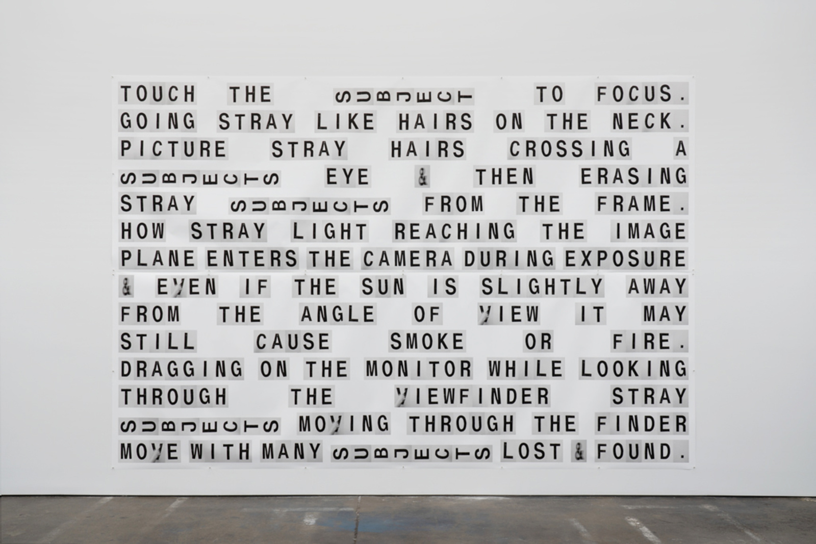
The STRAY WORLD project began when I got in touch with David during the early days of the lockdown. I made the Wet Letter Alphabet for a show called WET WORDS IN A HOT FIELD, and I was thinking about how the text works in that show might work as screen compositions, since they were composed on the computer —computer screen as substrate, basically. I was curious about animating the screen compositions, I always have an interest in enlivening images in some way.
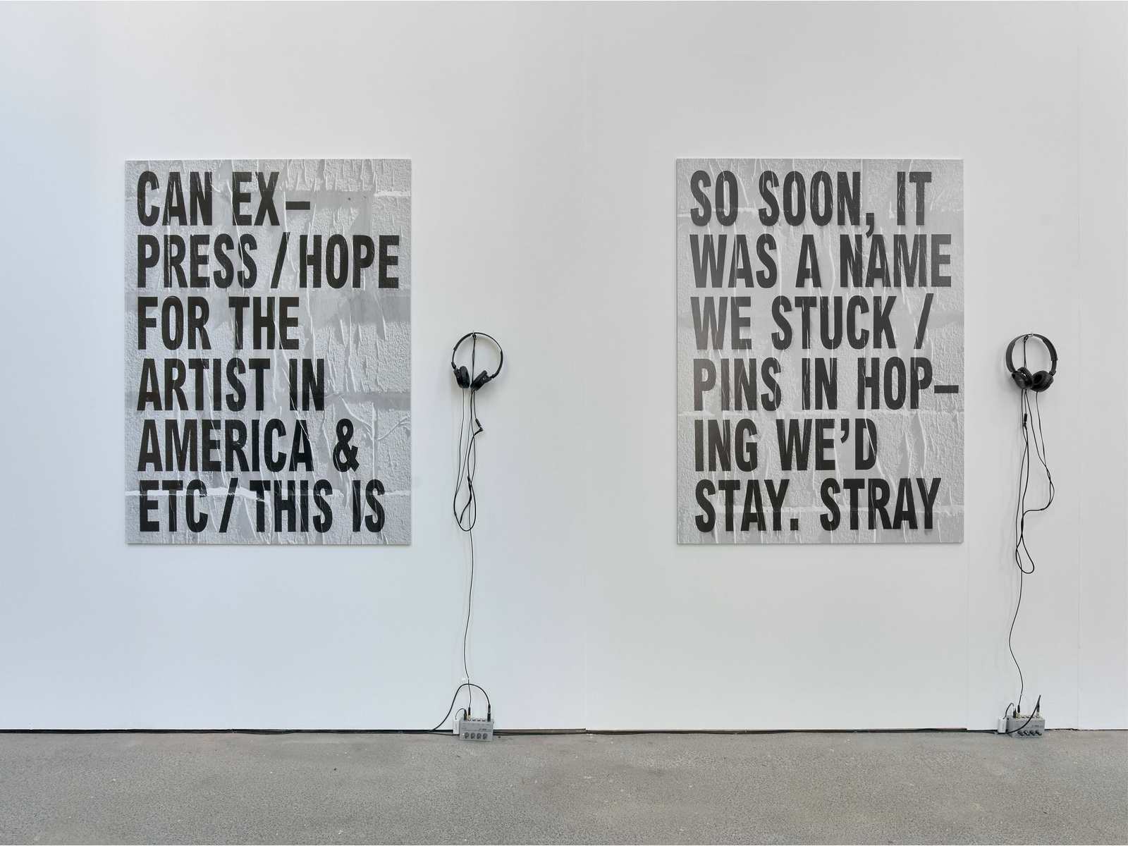
Shannon Ebner, STRAY (2017). Archival pigment prints mounted on aluminum, 2 parts. Each: 48 × 36 in. / 122 × 91.5 cm. Left: Susan Howe, “Articulation of Sound Forms in Time,” from SINGULARITIES (Middletown, CT: Wesleyan University Press, 1990) Audio: 0:15. Right: Nathaniel Mackey, “Song of the Andoumboulou: 50,” from SPLAY ANTHEM (New York: New Directions, 2006) Audio: 3:38. Photo © Rob Battersby
I initially thought you wanted to make an animated GIF that would transition from one letter to the next. But as I heard more about the project, I quickly realized it was not going to be so straightforward. Throughout the process, that first idea evolved into what is now the radio (the changing letters on the homepage of stray.world) which spells out a text one character at a time using the Wet Letter Alphabet
SE: I had also started writing during this time and was thinking about the temporal nature of the project, and I began to consider what it would mean to collect the various components of the work on the place/no place of the internet. I’m interested in the website as a format because it’s something that has a pulse in a funny way.
DR: At the start, the site was meant to be a container for various projects. Some of the images were installation shots. We got rid of those and that really marked a change in what the site would be.
Installation in progress for Shannon Ebner’s exhibition A GRAPHIC TONE at kaufmann repetto, Milan (2019).
BS: I also wonder how the turbulence of that time (early COVID-19 lockdowns, BLM protests in New York) had any effect on the project? In your first email to us, I remember you mentioning that this project felt, in some way, tied to that moment.
SE: The subject line in that first email was “The Americans” because Source Type is based in Zurich, and that’s where Robert Frank was from. It was a cheeky reference, but I was thinking about the ways the project dealt with American identity, racism, outsiderness, and the photographic essay as a long form poem. I was curious about what it would mean for us two Americans (David and I) to reach out to you in Zurich with the idea of publishing a website? So while the project was happening amidst the unrest you mentioned, I don’t necessarily want to reflect on it in direct relation to that context, but rather how it was happening in parallel.
DR: When I looked back at the early emails, I was reminded of the purgatory-like feeling of that moment. There is an unboundedness to that amount of time, which the project not only expanded to fill, but also just lived within. It was up in the air where the work could go and what it would become, and that felt specific to those periods of lockdown. I think the project would have turned out much differently had it occurred at a time when there were more pressing demands.
BS: It’s interesting how this odd sense of time informed the project, as it also feels very present within the text— there are mentions of things like asynchronous time, circular time, Nathanial Mackey’s idea of “broken time,” etc. What opens up for you when you embrace this asynchronicity that more linear or direct mediums (like photography) may not allow for?
SE: The site itself does follow a certain chronological progression. But there is also this aspect of parallel time that happens, that is, there is looking and listening time and the time of the body. These different cognitive engagements don’t always sync up, or they scramble the order of what might draw us into the art object. I was looking to create a space where multiple registers of sound and time could co-exist alongside each other.
DR: The radio also works with its own time. For example, there’s the way it churns through text, letter by letter, which requires an amount of time, labor, and concentration. But even more than that is the fact that it runs on its own, in a way that is exterior to the browser. It works more like a window that you look into to view this thing that’s already in progress. There is overlapping that occurs between this constantly running phenomenon and the work that you have to do in your head to read the text letter by letter , which then all solidifies into a simultaneous print format at the end.
SE: David, at one point you had to really describe to me how a website assembles itself when a user visits, which is opposite to the way the radio is constantly broadcasting. So anybody, anywhere, at any point in time, can log onto this website, which creates a kind of connective tissue. It also brings looking and listening together somehow, in fact you first referred to the radio as a “silent radio” which is the name for those LED displays that you store front windows all over in the city.
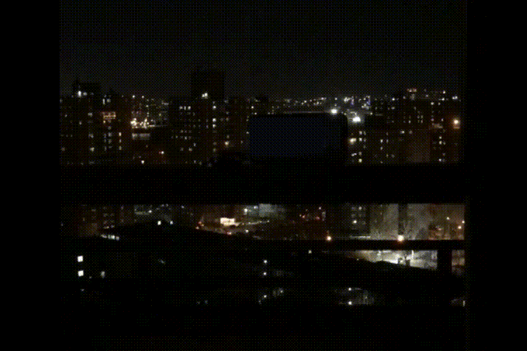
Clip from A Silent Radio, O-R-G (2020)
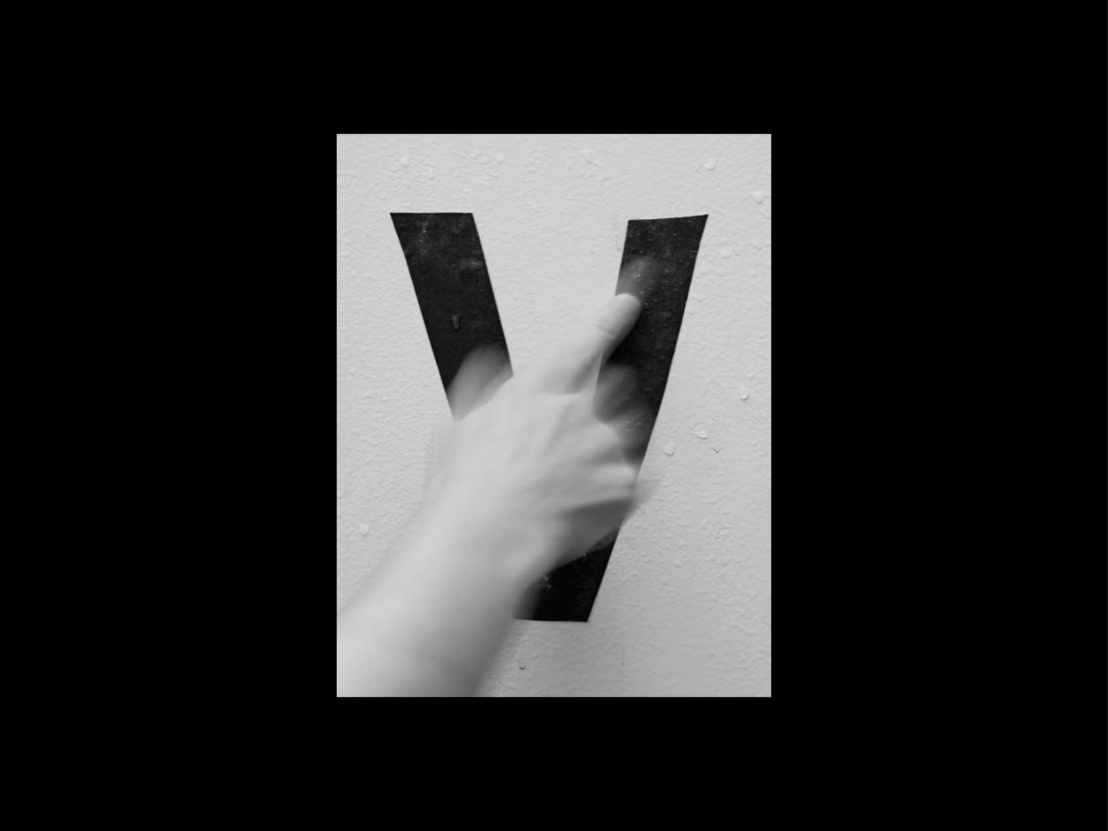
BS: The radio is created from the Wet Letter Alphabet photographs. These letters, to me, point to a larger theme of slippage or imprecision in the project. Language is slippery, and there seems to be an attempt to understand how photography or the camera can be more than a “precision instrument.” What is revealed to you in these moments of slippage?
SE: One of the impulses for the Wet Letter Alphabet was to bring an element of the hot and wet to what had been a somewhat cold and dry collection of images. And water is intrinsically not the type of thing that you want around a camera, so there’s some slippage in that. But any kind of photographic alphabet that I’ve made always has very specific material reasons for its existence, external pressures… in this case, gravity.
But there was also this pressure related to the timing of the project and its duration over two election cycles and a movement away from democracy. I was living in Los Angeles for most of the project, and for years on end we were having to deal with fires and drought and how it was causing displacement. So the alphabet came about partially just from thinking about these cultural conditions and pressures that everybody has been trying to live with.
And to get to this idea of slippage, I’m thinking about what actually stops if the camera goes in the water? With WET WORDS IN A HOT FIELD, I was working with the instructional language from a number of different 35mm DSL camera manuals. After years of working with so many other people’s work, collaborating with the anonymous and omniscient voice of the apparatus, turning the gaze around, was a necessary turn for me, even if the “voice” of the camera is quite cold and brut. So what happens in that space, if you move away from the gaze of the camera? Or if the camera gets submerged in water, how does that change the subject’s position? What happens to the utility of the object, how does it affect the human? When you think of the camera, its job of watching, recording… all the things that cameras give and take from us, maybe a space can open up where all of that relaxes. If the camera and/or subject can slide into a place of indeterminacy, that’s always my starter place.
DR: There’s also something interesting that happens when you see the wet letters put back into a grid, as they were shown at Altman Siegel.
SE: I’m glad you brought that up, the grid, as it goes back to one of the first questions about this idea of “straying,” and how I landed on that word, and how its meaning changed. With this project I was interested in getting away from the grid, away from electronic communication, and away from a certain machine logic of that kind. So with the idea of WET WORDS IN A HOT FIELD, the heat could be from foothills burning, or an angry mob storming the capitol, but it could also be a different sort of body heat that conducts energy in other ways. The body heat that occurs when I reach out to any one of the people involved in the project. There’s an intersubjectivity that happens, and an intertextuality that happens; there are slippages and things that are unknown. There was this larger impulse to get off the grid of how I was making things up until that point, to let the camera lead. Camera as transducer?
Shannon Ebner, from WET WORDS IN A HOT FIELD (2019), SECTION 3: MULTIPLE EXPOSURES, Archival pigment prints on Tyvek, PANELS 1 + 2, 18 × 179 in. / 299.7 × 454.6 cm each, with thanks to Maziyar Pahlevan.
BS: What changes for you when language is photographed or becomes material, like in the case of the Wet Letter Alphabet? Do you differentiate between reading and seeing?
DR: For me, the difference is 100% that the text or language is *in* the world. It’s that simple and also that complicated. Anytime you receive a message, it’s embodied in something — whether it’s a voice, or on paper, or just has a particular visual form. I don’t think those things can be separated. Even the space I put between words, my diction, all of that affects what’s being said. There’s no way to tease those things apart.
SE: I’m of a generation where language as material is something that is just a part of the artistic vocabulary. I’m thinking of people like Jenny Holzer, Glenn Ligon, Barbara Kruger, or Jean-Michel Basquiat, his drawings and dense text pieces specifically. The way that seeing and reading operate in all of this work is sort of a given. Having early encounters with this work were foundational experiences for me, being in front of art objects that were doing both, in my mind, makes this act of seeing and reading fluid even if I am attracted to its dissonance or the dissonance that occurs when you have the encounters.
DR: There’s an inherent tension in what you’re describing. Reading is a one dimensional act and seeing is two dimensional in the way you scan the surface.
BS: This tension of seeing and reading becomes even more complicated with the creation of a typeface using the Wet Letter Alphabet. How did the transformation from the fixed state of a photograph to the editable utility of a typeface affect your understanding of those images?
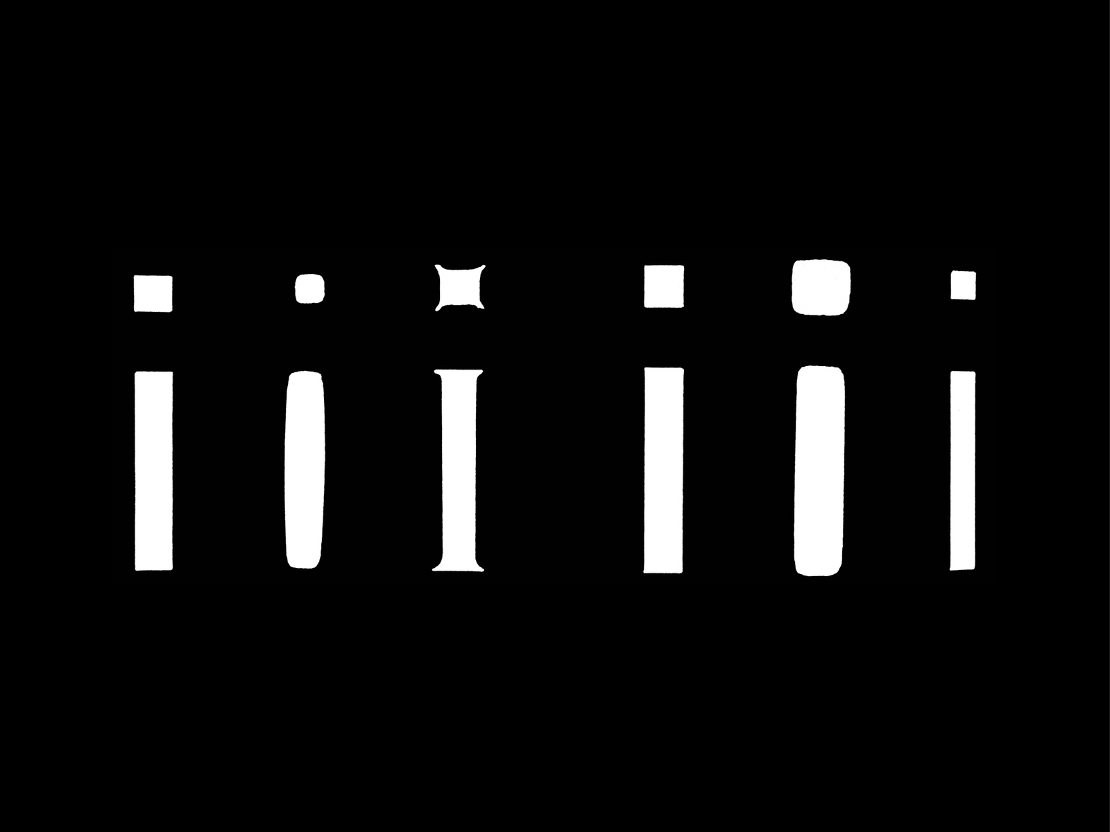
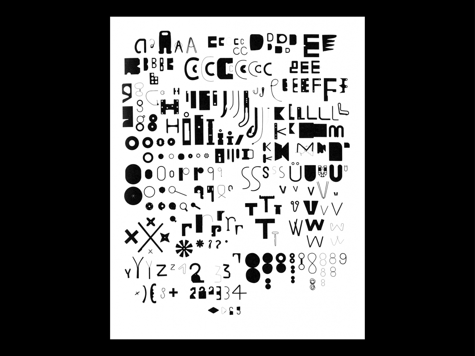
Wet Letters in use
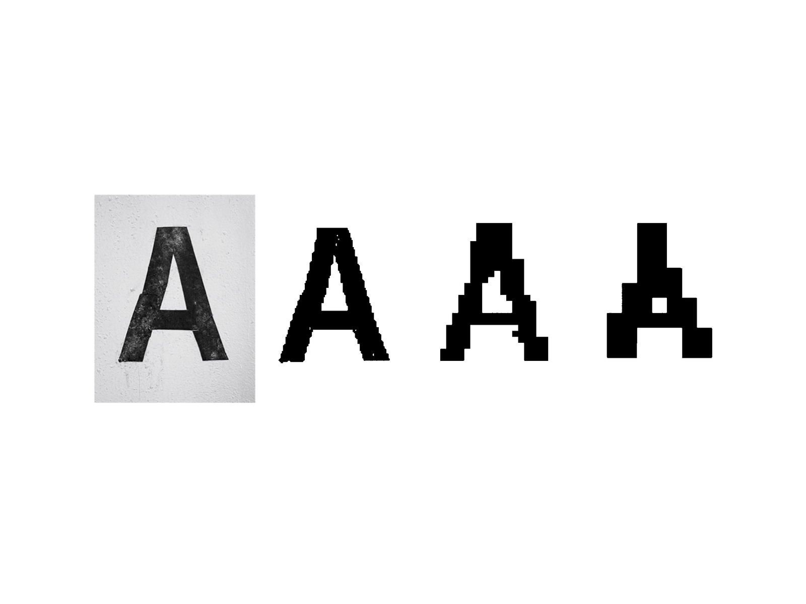
Bitmap testing of Wet Letters
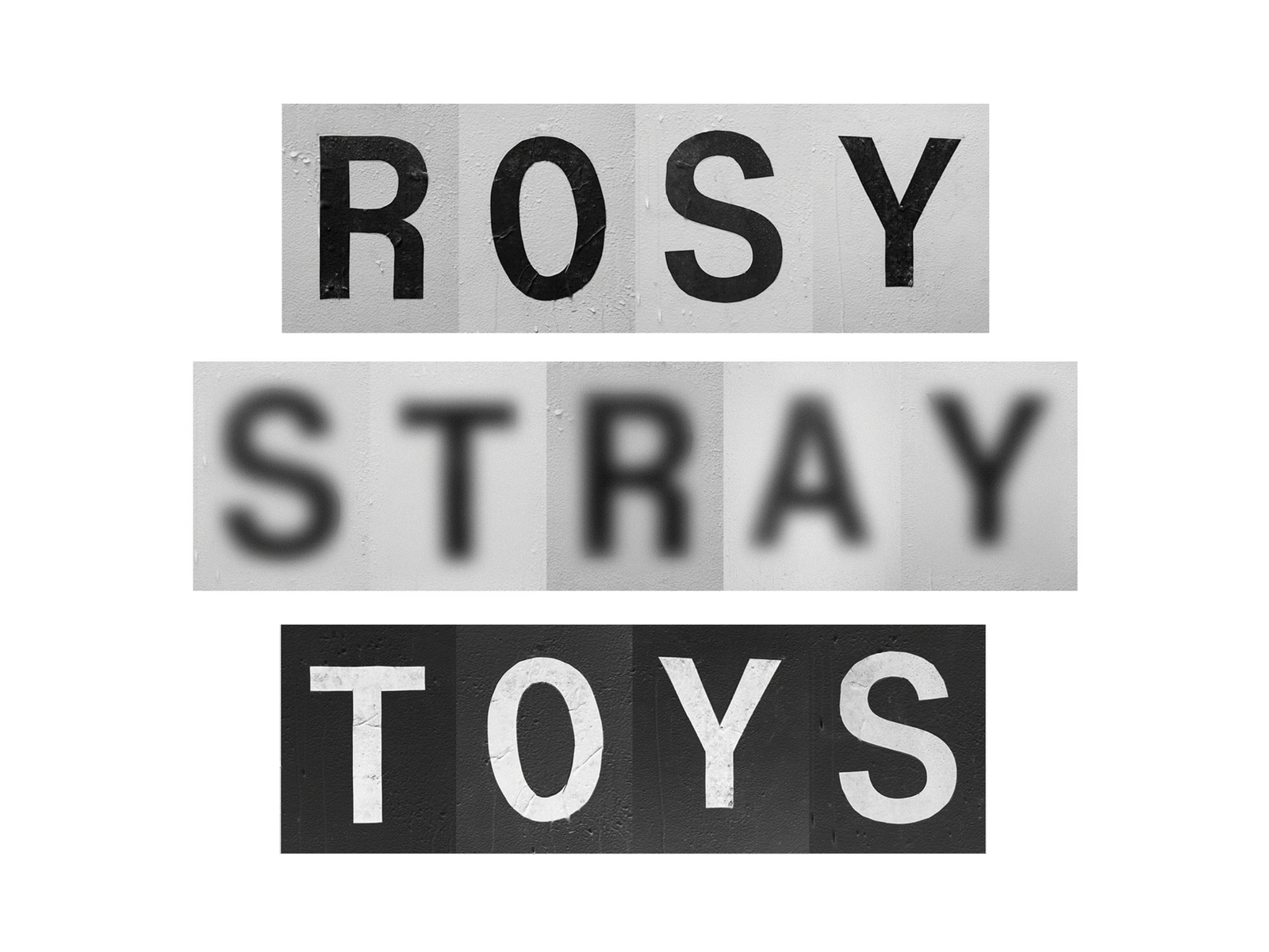
Various styles of a photographic typeface: Regular, Blurry, Negative
SE: A friend of mine made a comment to me that digitizing this photographic typeface, and making it available as an edition, puts it back in the world as a material. That, to me, is something I’m really interested in. But then, I think it also will always be an artwork, which has a different utility than any other typeface that exists on Source Type.
BS: It also feels very different from any of our other fonts because of the amendment to the Source Type EULA (the contract between the foundry and the end user) that is included in the edition. Your amendment obligates the user to ask for permission to use the typeface after they purchase it. Could you talk about the tension between wanting control and embracing variability?
DR: The difficulty with a project like this is when it is already filed in an existing category, it’s hard to make somebody read it as having an extra resonance. That‘s what I’m always trying to do, to take some known, agreed-on thing and reconsider it with extra gestural, or poetic, qualities. I think that’s what’s smart and interesting about the modified End User License Agreement (EULA) —it requires an acknowledgment that this font is working in a different way. It invites conversation and creates the complicity of a contractual relationship.
SE: Thinking about the EULA was a new concept for me. I put it in relation to Felix Gonzalez Torres’s certificates of authenticity contracts that exist around his endless editions. The art historian Miwon Kwon has written about the contractual aspects of Gonzalez Torres’s work and how it formed a “strangerhood community,” which is a really beautiful phrase for how to conceptualize all of this. I sort of reject the idea of an end user though, the work doesn’t end… it keeps going, or it gets transferred. And the nomenclature of a “user” actually chafes. The EULA contract as a premise challenged me to identify how the digitized typeface will go out into a very specific type of marketplace and remain an artwork. I’m interested in how it might continue to be relational and not simply forfeited.
DR: It’s interesting to go back to the radio. Whether it’s the radio on the site, or just the radio proper, both can synthesize a community.
SE: This also makes me think about the option to desktop print the website as a loosely-fastened publication. This is a DIY enterprise, essentially, but it opens the possibility for yet another micro-community to exist, equally as atomized and synthesized.
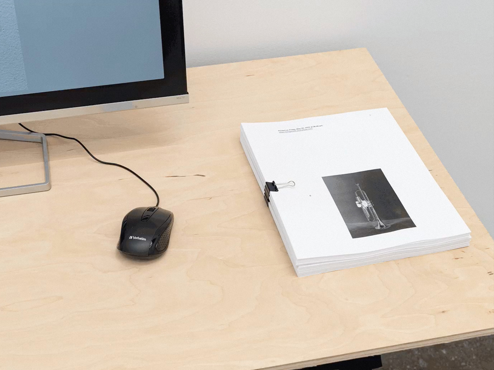
Print out of the STRAY WORLD website. Photo: Altman Siegel Gallery, San Francisco.
BS: As you talk about the contract, it feels like it opens up the work rather than restricts. Or maybe I’m thinking of it more as a prompt for dialogue, rather than a set of rules?
DR: It is still about restriction, but it’s much easier to read something for its poetic qualities if you give it some space. You need the contract to induct the person who’s receiving it into how they’re supposed to think about the font. This space to think isn’t just conjured on its own.
SE: When I first started thinking of this contract, I started thinking of rules like, “no merch.” But then as I was writing this I realized I was at “no,” and that sort of cuts off any passes. I eventually got to the place of, well, “who’s merch?” My concern was having this very specific photographic typeface, that will always in some way signal back to me, undergo something that reconstitutes it to such a degree that it alters its integrity. That’s what it really comes down to. It’s not so much control, but integrity, or even the work’s sociality — what happens when the possibility of co-authorship opens up because that is what the amended EULA contract invites.
BS: David, in your own practice you produced a similar project with MTDBT2F and Kadist where you designed a font skeleton with a near infinite number of formal outcomes. Central to that project was the contract and, to me, one part in particular: “Further, on signing and initiating this 10-year license, KADIST ART FOUNDATION asserts an up-front commitment to allowing this eventual process to run its course, without excessive concern as to the form of the logo at any one particular moment, and with willful disregard to the winds of fashion or the mandates of technology, but instead, to pledge and bond itself to the principle that slowness and attention are their own rewards.”
MTDBT2F font for Kadist Art Foundation, Dexter Sinister (2013)
DR: That project initially came out of the invitation from Kadist to buy the font for their collection. We (Dexter Sinister, myself and Stuart Bertolotti-Bailey) thought that was interesting, but it would be more interesting if Kadist used it. This gave us the excuse to develop the font for Kadist’s identity, and the font (and their identity) would then change over time. So making the contract, already a useful form of agreement between two parties, allowed us to come together on some common poetic goals. When we launched the project in San Francisco, we had a ritual contract signing by both parties with a software lawyer present. All of this allowed us to frame the font as an artwork rather than a commercial typeface. Or, as the transaction was commercial, *both* an artwork and a commercial typeface. Again, I’m reminded of the STRAY WORLD radio in the way that it just runs on its own accord and we don’t fully know where it’s going. With the Kadist project, it also just goes where it goes and they agree to accept it.
BS: In the discussions leading into the Wet Letter Alphabet font we talked about a niche history of photographic type and letterforms. Are there any moments from this history that resonate with you?
SE: For me, I’m interested in the possibility of both made and found language, in different types of graphic materializations of language. But this is different from the idea of photographic typefaces, historically speaking.
DR: In this case, I’m less interested in conventional photographic fonts, even though things like Paul Elliman’s found letterforms are completely resonant. I’m more drawn to Muriel Cooper and her explorations with phototypesetting. Just the act, the technical way in which phototypesetting works, and how you can change the angle of the negative to change what the letter looks like. You can blur it, slant it, sheer it, and so on … that to me is more immediately relevant. It’s the consequence of some real action in the world, and I think that has resonance with the Wet Letters Alphabet in a way that some other strictly photographic typefaces might not.
I’m also reminded of Muriel Cooper’s early experiments with anti-aliasing in order to make type more legible on a screen. She followed the counterintuitive approach that you need to blur the type to make it appear sharper because of the coarse raster of the screen. It makes me think about how we’re essentially dealing with light, and that is photographic. I think the nature of a letter on the screen is so different from the nature of an impressed letter, the way it’s essentially anti-aliased differently each time it’s projected depending on where it falls on the raster grid. All of that feels very much like phototypesetting. To me, letters on a screen are inherently photographic, or at least an approximation, due to the fact that they’re made of light.

On screen typographic experiments from Muriel Cooper’s Visual Language Workshop (1974–1984)
Distortion tests by Adrian Frutiger from Typography of the IBM Selectric Composer (1967)
Karl Gerstner, Compendium for Literates: A System of Writing (1974)
Neville Brody, FF Blur Font (1991)
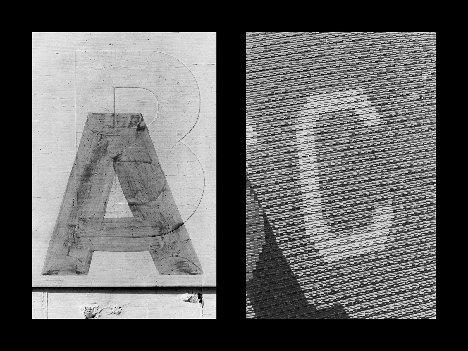
Lee Friedlander, Letters from the People (1979–1988)
Paul Elliman, Found Font (Bits) (1995–ongoing)
BS: Lastly, in our conversation you sent over the phrase to include in the EULA, “NON IDEAS SED IN REBUS” which translates to “no ideas but in things.” I’m curious about how this resonates with you in the context of this project?
SE: This Williams line has always been for me like a refrain or chorus, it’s one sentence but it might as well be an engine. Converting it to Latin gives it renewable energy. For me it’s a reminder, almost like an unspoken code of conduct or a clarion call sending up a spark for empirical ways of doing and making things.
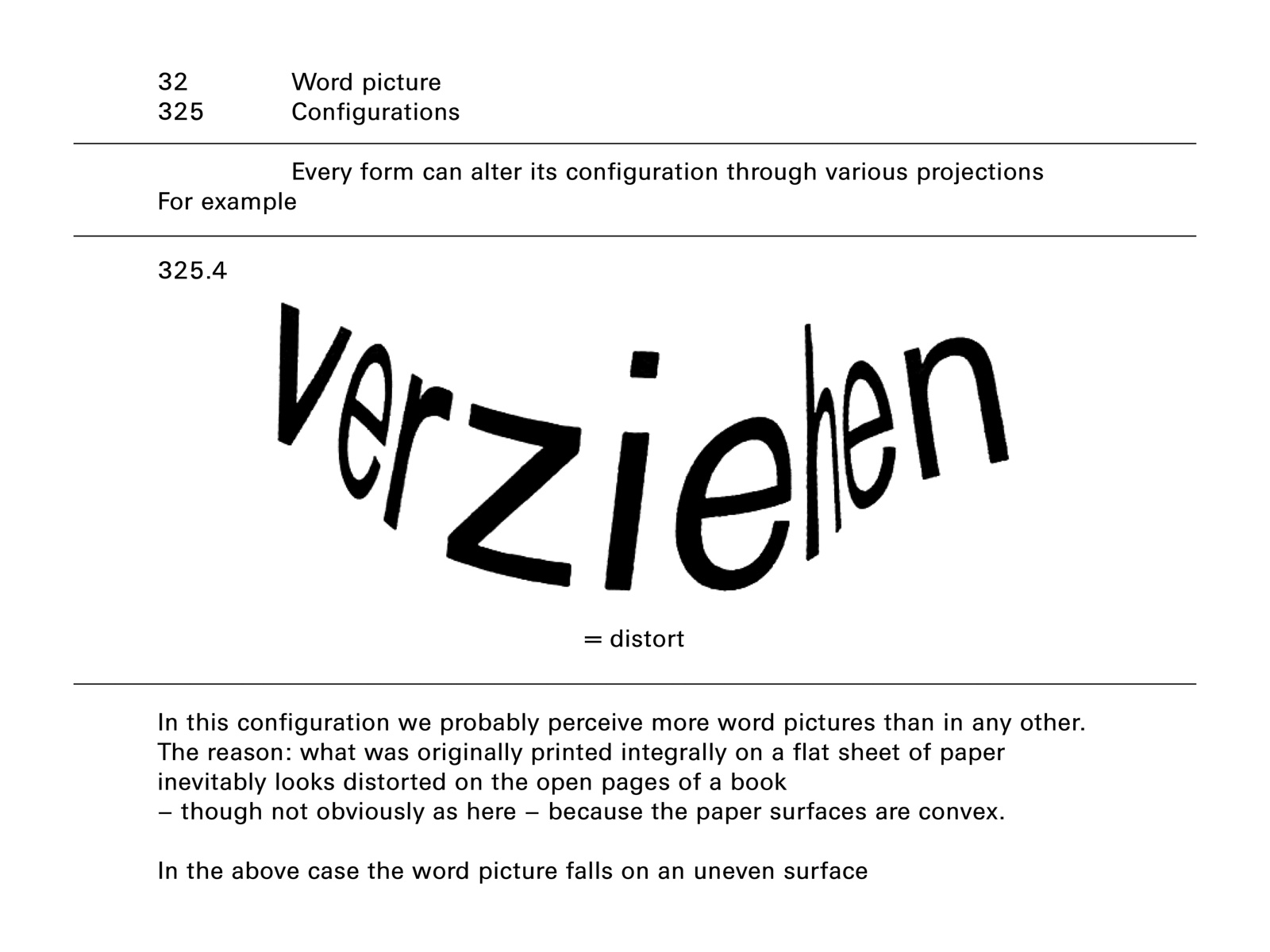
DR: This question circles back to where the project started, so it’s probably a good one to end on. “No ideas but in things” is a line from Paterson by William Carlos Williams, which I was reading at the time Shannon first approached me with the project. As it was on my mind and I figured it was also something she knew and probably well. We then started talking about it. It’s an exceptional thing, a book-length poem as a collage of found text which attempts to tell the story of this town in northern New Jersey where Williams also lived. Each found text is put next to each other and supplemented with writing by Williams, as far as I understand it, and the text moves along, concretely, page to page. Some of the inserts are very long and some quite short. They feel like so many stray fragments. Each of the texts also has a particular typesetting, but it is not a photographic typesetting, meaning it’s not a text as it is found in Paterson and recorded with a camera. Instead, each is typeset, and I’d guess phototypeset given the edition of the book I read was from the early 1980s. The typesetting of each varies, but only within a limited range. I think it’s that ambiguity, whether the typesetting is intentional or pragmatic, whether it’s the poet’s voice or the city’s, which is absolutely exciting to me when I read, well look at, it. The poem reads like one long walk.
The line “No ideas but in things” appears early. I already knew it and I knew it was Williams, but I didn’t know where it came from. So stumbling on it here was exciting. It is such a compelling idea, and foundational in the way that I think about work. Everything we find, read, see has a form, a body, a host, there’s never just pure communication — no spirits, just so many letters (and each so particular).

William Carlos Williams, Paterson (1946)