LYTE:
Type in Perspective
In 1915, Danish psychologist Edgar Rubin published Visual Figures, his doctoral thesis famous for containing the eponymous “Rubin’s vase.” Also known as Rubin’s Face, the image illustrates a kind of figure-ground switching that alternates, in the viewer’s mind, between a single vase and two mirrored faces. It was revelatory at the time for demonstrating a fundamental principle of visual perception: that without the usual markers that determine the “figure” in an image as opposed to the background (depth, mostly) the brain shapes for itself what it sees.
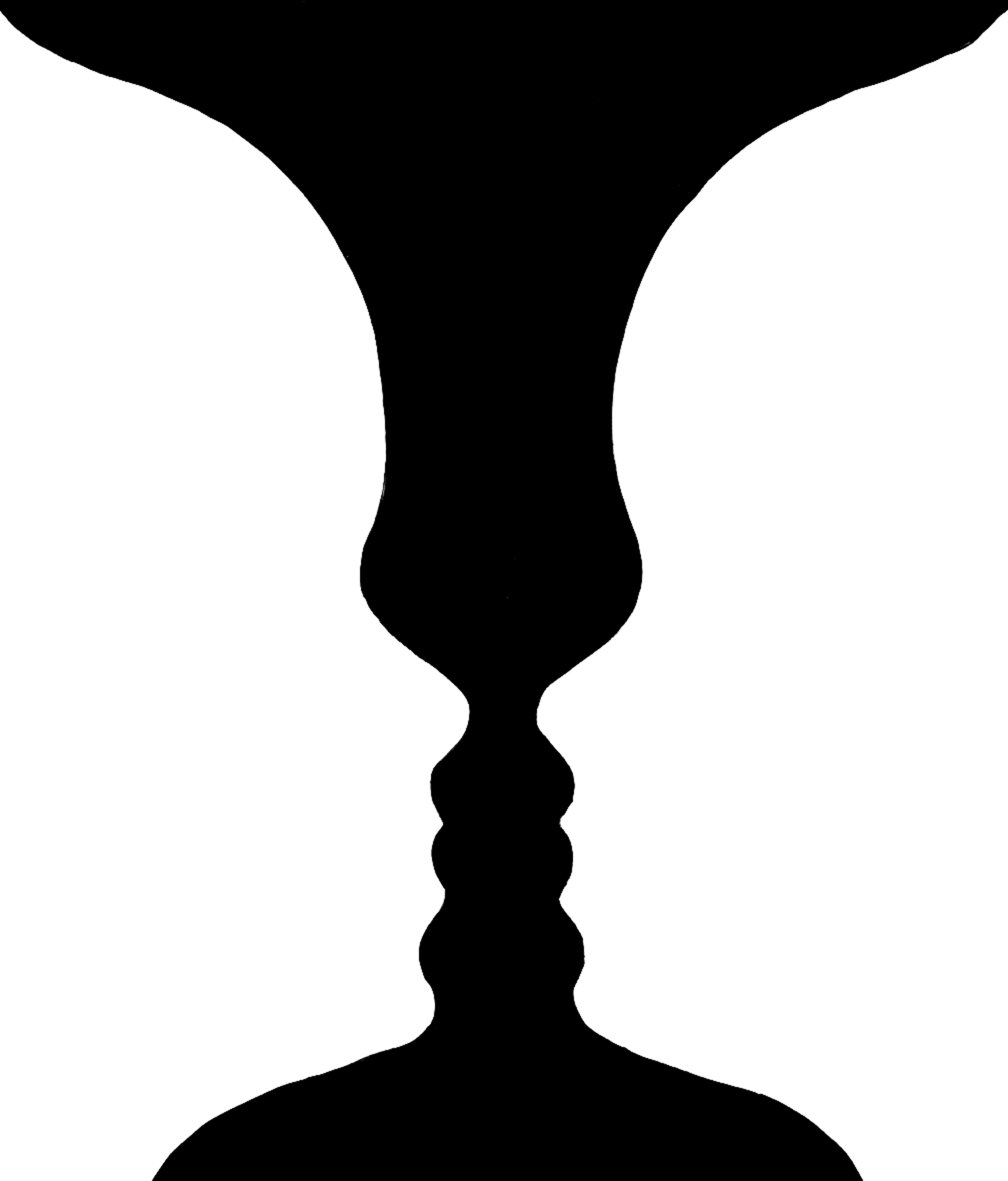
Rubin’s Vase (c. 1915)
But the image is also remarkable as proof that the concept of visual multi-stability can be intentionally designed: visual structures, in other words, can be built to include multiple meanings. Swiss artist Markus Raetz was similarly fascinated by this fluid aspect of perception. He created multi-stable works whose readings were dictated by the viewer’s circumambulating around the piece. Christian Moeller and Pete Conolly would later imagine and install a larger multi-stable work with Tower of Babel in Graz, Austria. The piece consists of 56 rectangular panels, legible only from particular vantage points en route to the Eggenberg Palace; the words “Turm,” “zu,” and “Babel” (e.g., Tower of Babel) relate position to perception, and ultimately the limits of language.
Whereas Raetz, Moeller, and Conolly play with visual multi-stability, MC Lyte (née Lana Michele Moorer) uses the homophone—a word that shares the same sound as another word but differs in meaning—as her muse, introducing us to auditory multi-stability. In MC Lyte’s brilliant song Lyte as a Rock, the rapper uses multi-stability to great effect, her name itself a bespoke homophone to “light,” a nod to her original stage name of Sparkle.
Lyte as a rock, or I should say a boulder
Rolling down your neck, pounding on your shoulders
Never shall I be an emcee, called a wannabe
I am the lyte, l-y-t-e
— MC Lyte, Lyte as a Rock
With the interweaving of the repetitive phrase “I am the Lyte” and the staggered accompaniment “… as a rock” — we as listeners perceptually switch between the connotation of Lyte (n.) as a person, as a source of illumination (e.g., John 8:12), and light (adj.) pertaining to weight. When we affix to the idea of an inconsequential rock—a “light” one—MC Lyte undoes this notion immediately, comparing herself to a boulder, a monumental force. Multi-stability here is a kind of lyrical freedom.
Multi-stability, for me, exists as a survival mechanism masquerading as a perceptual phenomenon. The opportunity to observe alternate readings within a single visual or acoustic form defies a rigid rubric; even if we’re looking at or listening to the same thing, what you see or hear may be different than what I see or hear. As a designer, I could employ multi-stability like code-switching, expressing a language that provides openings only to those with discerning eyes and ears. Or, alternatively — and this is more interesting to me — I can recognize ways to stretch something that I see, even if narrowly defined, into a meaning that is elastic, and encompassing of divergent perspectives. In the last couple years, amid a persistent global pandemic, a civil rights boiling point, and a turbulent American election, the world has seemed encased in binaries; alive or dead, infected or protected, racist or anti-racist, GOP or Democrat. I found myself thinking about Rubin’s vase, and what the phenomenon exudes — a sense of freedom from locked vantage points.
I’ve observed this same expressive freedom when hackers and gamers type in 1337. Known as leetspeak because the numerals 1-3-3-7 can be read as L-E-E-T when flipped horizontally and vertically, it is an internet version of multi-stability that substitutes letters with numbers and symbols. The letterforms are always hiding in plain sight. I recall a design completed almost 15 years ago for an issue of the New Zealand publication The National Grid, imagined by Jonty Valentine and Luke Wood. The editorial focus was on a hacking syndicate. I decided to create a 1337 logo for the magazine using OCR-A — a computer optical character recognition typeface (e.g., man vs. machine). The memorable takeaway was that it was exhilarating to create an artifact with an alter-ego.
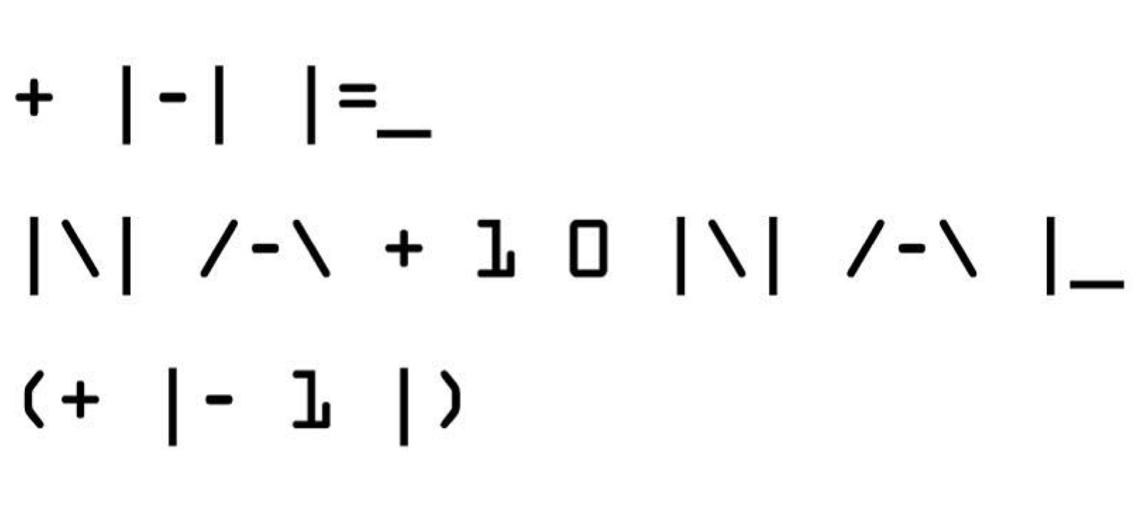
Identity for the ’Hacker Issue’ of The National Grid (editors: Jonty Valentine & Luke Wood)
In starting to think more intentionally about how multi-stability could be applied to my own design work, I recalled that in Rubin’s vase, the multi-stable forms have a shared anatomy. The faces and vase share a silhouette; they are a kind of ligature. I set out to explore this in a series of visual investigations that felt both urgent and intriguing. In its elegant resistance to rigid structure, the concept of multi-stability also pushed me to defy my own silos of perception. I was no longer swayed by the pull of reductionism, and the immediacy of “less is more.” Through the lens of multi-stability, intentional maximalism became a vehicle for encouraging expansive and plural systems. Multi-stability as a design ethos welcomes multiple interpretations, and rewards patience. I started to prefer slow design to fast design, longhand over shorthand. Weary of the obvious politicized binaries of yesteryear, I saw multi-stability as a way of fusing together seemingly incompatible ideas.
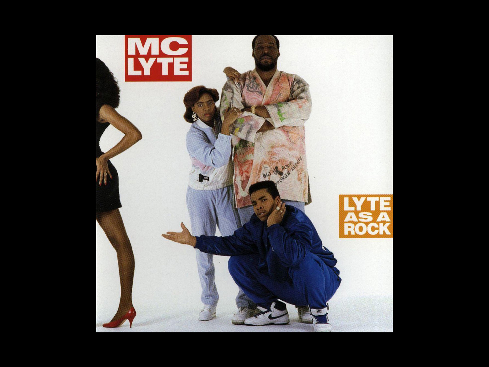
MC Lyte, Lyte as a Rock (1988)
But what forces was I opposing in seeking out divergent ways of reading? I recalled the origins of “stereotype,” a term that comes from letterpress printing, where it offered a trade-off between speed and idiosyncratic expression, dating back to 1720. In its original context, a stereotype describes a single plate, made from a plaster mold and capable of printing the recto and verso at the same time rather than typesetting individual metal movable type for each edition of printing. With stereotypes, books could attain reproductive accuracy and consistency, making copies relatively indistinguishable from each other. Stereotypes eliminated outliers through the means of production. Over time, this mechanical abbreviation would foreshadow the bridge to a cognitive abbreviation, re-coined in 1822 by American journalist Walter Lippmann who likened it to cookie-cutter ways of seeing people.
In Ridley Scott’s Blade Runner — a filmic feast set against a decidedly xenophobic and monumentalist vision of Los Angeles, stereotypes are interwoven into a seductive dystopian hypothesis of 2019 from the vantage point of 1982. Playing the film with the closed captioning on, I saw that the Chinatown banter was rendered simply as ‘Foreign Language’ within a cyber-noir take on Los Angeles. Language here evoked both the exotic and the familiar, in sound and pictures.
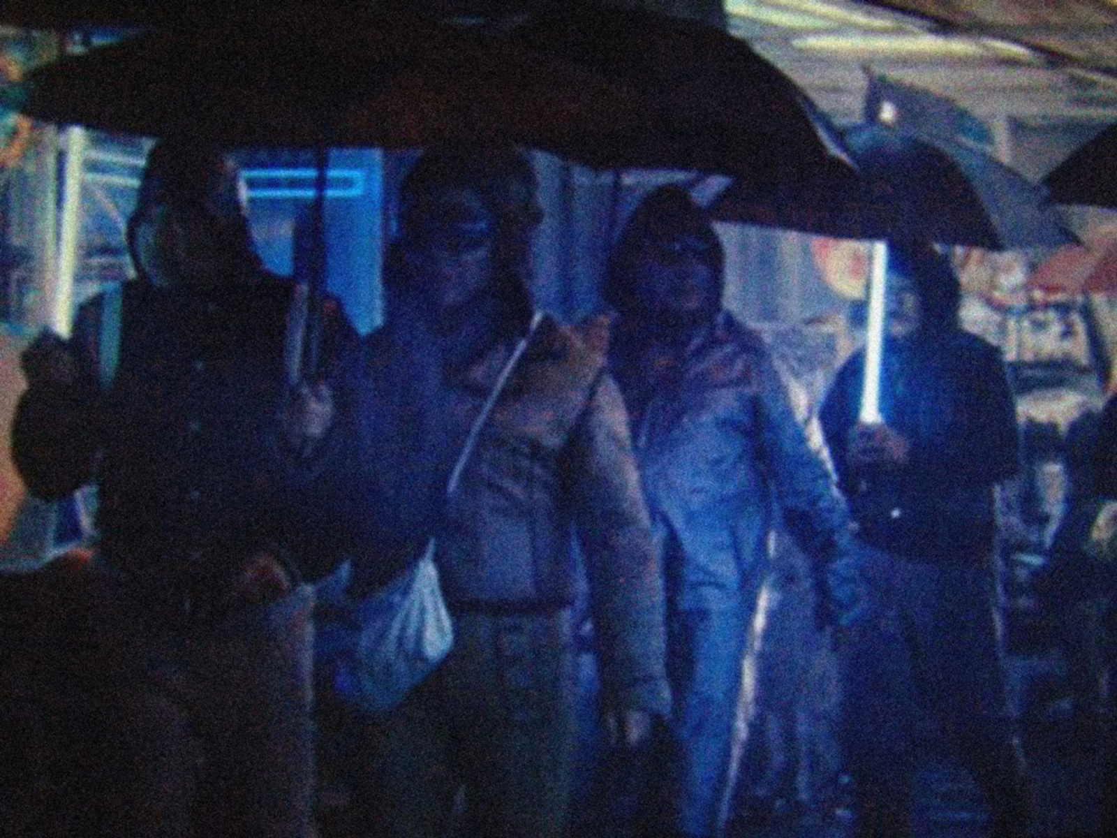
Umbrella light sticks used in Blade Runner, 1982
The film, even with its obvious flaws, is still a commanding force replete with inspired futurism from set designer Syd Mead. A haunting scene from Blade Runner is the violet-tinged atmosphere of umbrella light sticks strewn throughout a rainy Chinatown street. It was seeing that scene that led me to sketch a seemingly impossible bridge between two languages — English as a reassuring thread, and Chinese, presented cinematically as otherwordly. Forest — my given name, which is also a noun, can be rendered phonetically in Latin letters as ‘f-o-r-e-s-t,’ or by the Chinese character sēnlín (森林). Reduced to a single glyph, however, the letter ‘f’ becomes a meaningless consonant — just a sound. The character mù (木), the first character in the Chinese rendering of my name, however, still retains meaning as a standalone pictograph — it communicates the meaning of ‘wood.’ The attempt to merge picture-based morphemes with consonant-vowel phonemes, mirrored today’s patchwork communication style of emojis, words, and memes — the boundaries of which are becoming increasingly porous, even slippery.
I decided to bond the letter ‘f’ and the character mù into a single glyph, making it a new sound-picture. The ligature retains legibility by keeping each glyph structurally clear at discrete vantage points, hiding the alternating glyph inside of its own silhouette. This multi-stable ligature can reveal either f or mù from different vantage points. Like Rubin’s vase, the viewer chooses the dominant read for herself.
After I finished the Blade Runner project, I moved with my family from Harlem to Providence, Rhode Island. We were leaving a place steeped in Black visual culture — from the New Negro Movement of the 1920s to cultural touchstones like The Studio Museum in Harlem — for a place whose Black culture I knew little about. I was eager to become aware of the unique Black contributions to visuality in the Greater Providence and Rhode Island area. I started researching the state’s history and realized though small in geographic footprint, it was enormous in influence.
While Rhode Island was the first American colony to have separation of church and state, and welcomed persecuted minority religious groups to its shores, it had a dark underbelly. It would also provide an outsized contribution as a historical slaveocracy. My research led me to Katrina Browne’s feature documentary Traces of the Trade: A Story from the Deep North, a revelatory and uncompromising look at her own ancestors, the DeWolf family. Operating primarily out of Newport, RI, the DeWolf’s were the most influential slave-trading dynasty in America, imagining and orchestrating the triangle trade between Newport, RI, present-day Ghana, and the Caribbean. Liberal families in pursuit of religious freedom were actively involved in trading and owning African slaves, purchased with rum and textiles originating in Rhode Island. The best of humanity was then interwoven with the worst.
There is something profound, however, that happened over time in coastal Rhode Island. As African slaves started to achieve freedom through work and self-purchase, or by manumission, they contributed an aesthetic ideology of the highest order. The Free African Union Society, founded in 1780 in Newport, Rhode Island, for example, holds a unique distinction as America’s first African benevolent society. They chose as their first ‘logo’ the West African adinkra BOA ME NA ME MMOA WO, an aphoristic symbol which roughly translates to: “help me and let me help you” — a mark of cooperation and interdependence.

West African adinkra BOA ME NA ME MMOA WO
It is visual identity in the purest and most powerful sense. The adinkra that appear in colonial Rhode Island constitute symbols that were cherished, and found their way to distant shores alongside enslaved peoples moving though the Atlantic triangle trade — exiting through the ‘Door of No Return’ to face grueling plantation conditions in Cuba, and then on to the coast of Newport to work across a myriad of craft and maritime guilds before being granted freedom. They celebrated these adinkra as immutable, and unconquerable.
The final sketch contrasts the Twi word for tomorrow: ‘ɔkyena’ with the port city of ‘Newport,’ depicting the origins and destinations that defined historical vertices of the Atlantic triangle trade. Twi is a dialect of the Akan language spoken in southern and central Ghana.
I started with a simple fascination with multi-stability — a perceptual phenomenon that soon became a conceptual method of looking at the world today. Examples of this newly considered multi-stability are given, which are illustrated by typographic animations (f/mù, best/worst, ɔkyena/Newport) rendered in a custom typeface that was the result of a collaboration with Laurenz Brunner. This typeface is optimized for multi-stability, a way to say two things at once.
Draftsman-style lettering provides a uniform stroke, and stencil-inspired rounded terminals allow for bent forms to be concealed in silhouette. The 1982 unicase version of the African Reference Alphabet by Michael Mann and David Dalby served as another inspiration — thinking of historical attempts at bridging languages and dialects between African and European vantage points and multiple histories. The name of the typeface: LYTE.
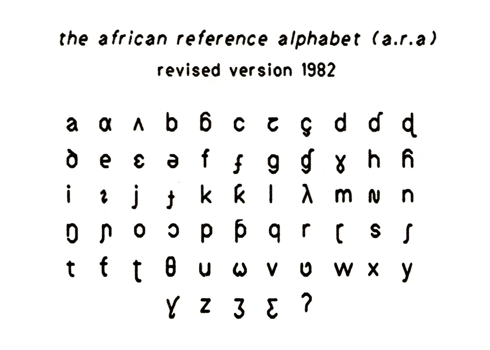
African Reference Alphabet (1982), Michael Mann and David Dalby
