An Ongoing Index of Curious Colors
Every once in a *blue* moon a color’s reputation outgrows its pantone chip and becomes a cultural phenomenon. More than a superficial “color of the year award” these shades often play a key role in conveying immediate, and at times, life-saving information. Source Type’s ever-growing Index of Curious Colors catalogs these hues and the stories that have made them legend, as well as provides answers to a spectrum of color-related questions like “what is the ugliest color in the world” or “how dark is the blackest black?”. Check back in as the list is updated and colors are added, or feel free to send us possible contributions.
Last updated 25.10.23

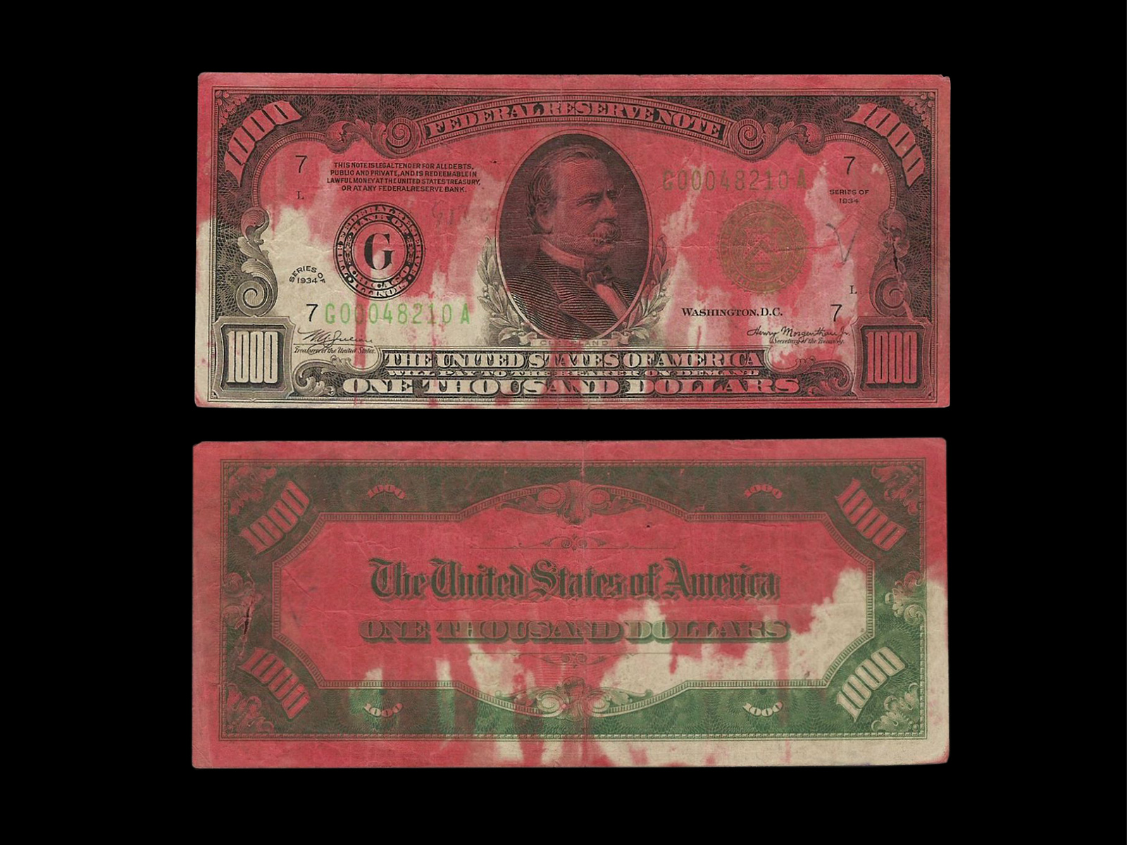
Dye-Pack Pink
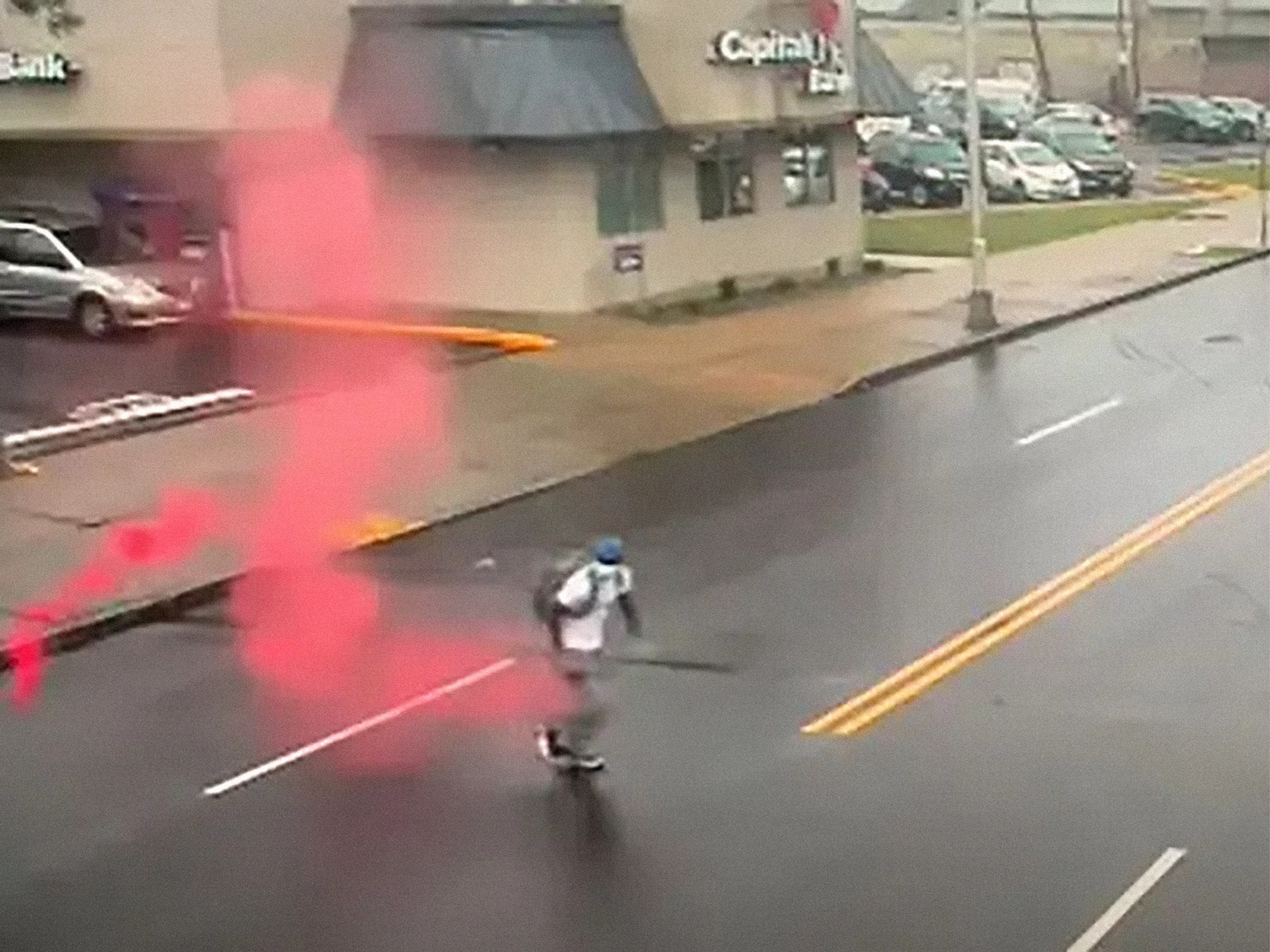
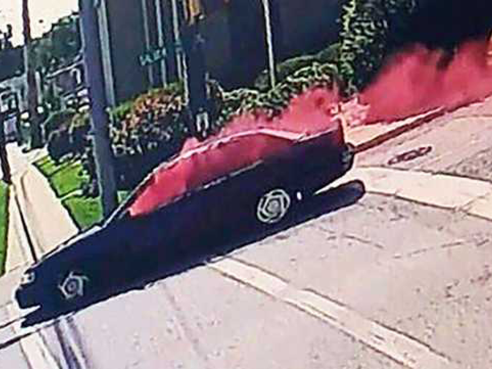
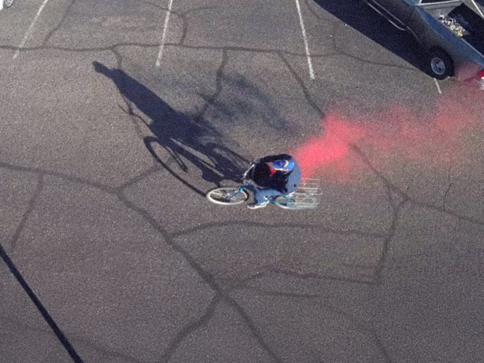
Caught red-handed! Dye packs—part of an Intelligent Banknote Neutralisation System—are security devices hidden inside stacks of cash. When triggered, they explode and release bright pinkish-red ink and smoke, making it easy to identify the thief and rendering the stolen money unusable.

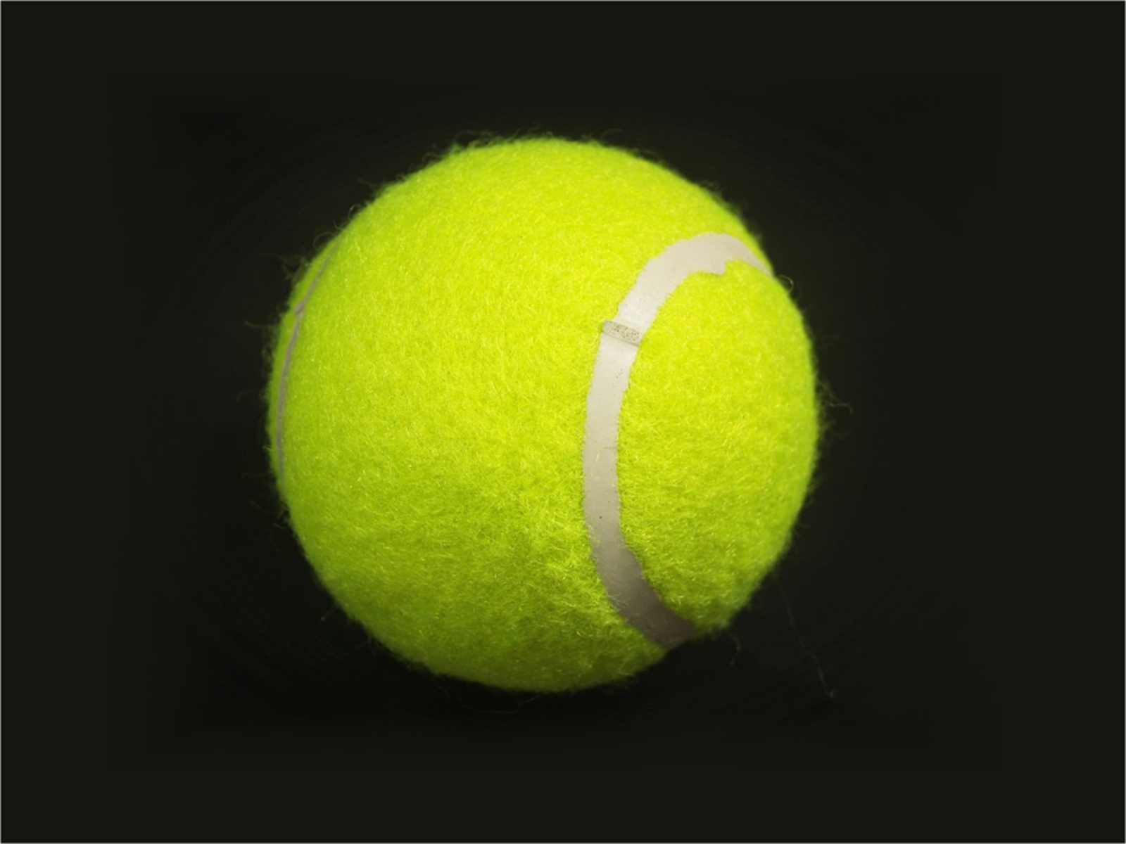
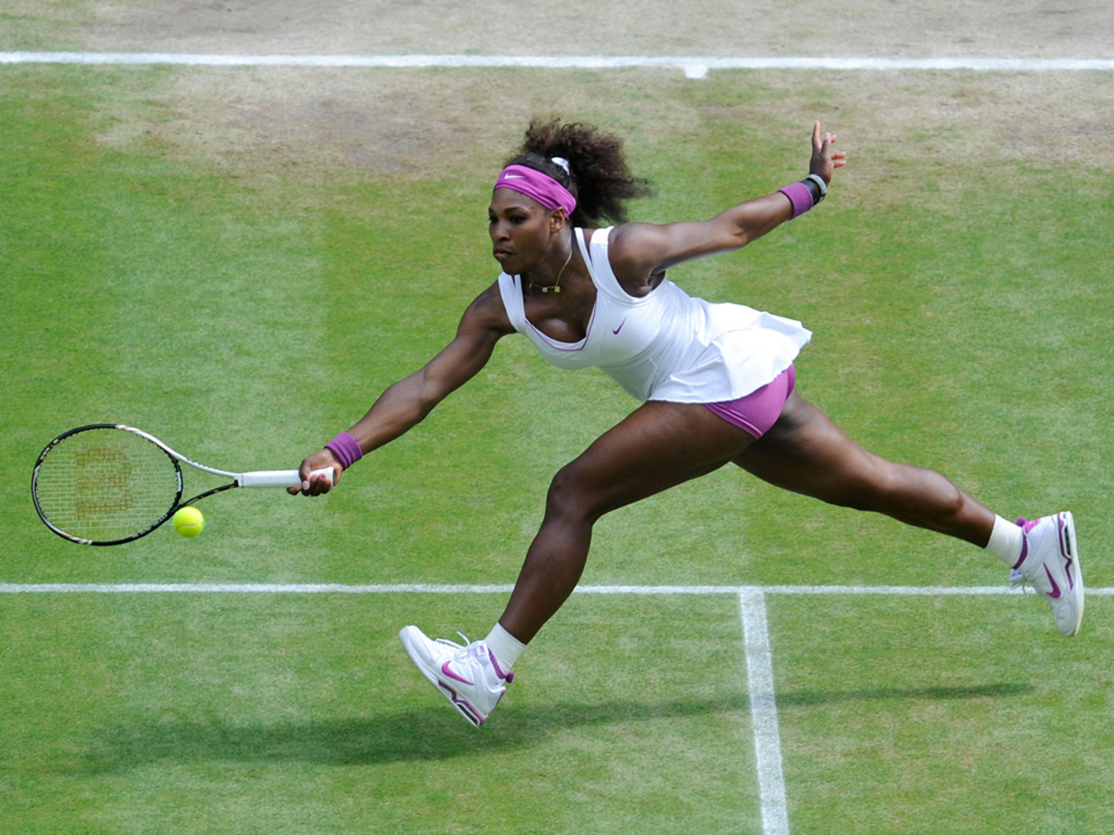

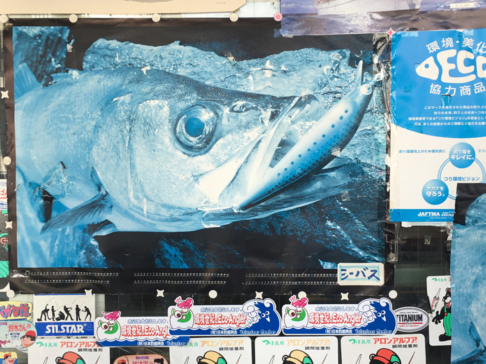
Tennis Ball Yellow
In the rulebook of the International Tennis Federation (ITF) it clearly states, “the tennis ball shall have a uniform outer surface consisting of a fabric cover and shall be white or yellow in color.” Previously balls had been white or black, but were switched to yellow for the ease of home viewers following the game on color TV. The official color of the balls, Optic Yellow, fell under a hot internet debate after a Twitter user posted a poll asking if people thought tennis balls were actually yellow, green, or other. The near 30,000 participants responded with 52 percent saying a tennis ball is green, 42 percent saying it’s yellow, and 6 percent replied with “other.” The debate inspired long form think pieces and even prompoted Swiss tennis star Roger to weigh in… “They’re yellow, right?”.

Photograph by Charles Villa
Photographs by Charles Villa

Photograph by Charles Villa
Photograph by Charles Villa
Photograph by Charles Villa
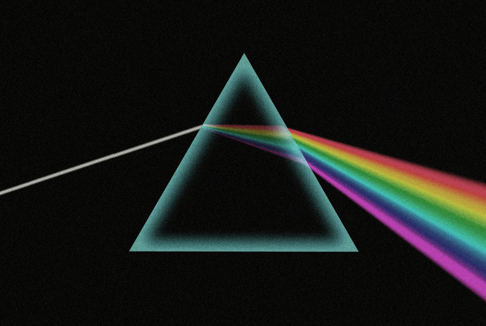
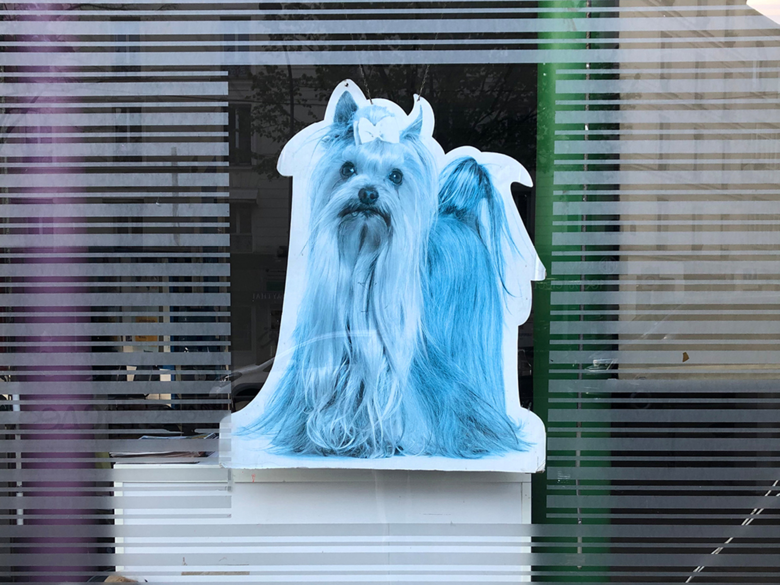
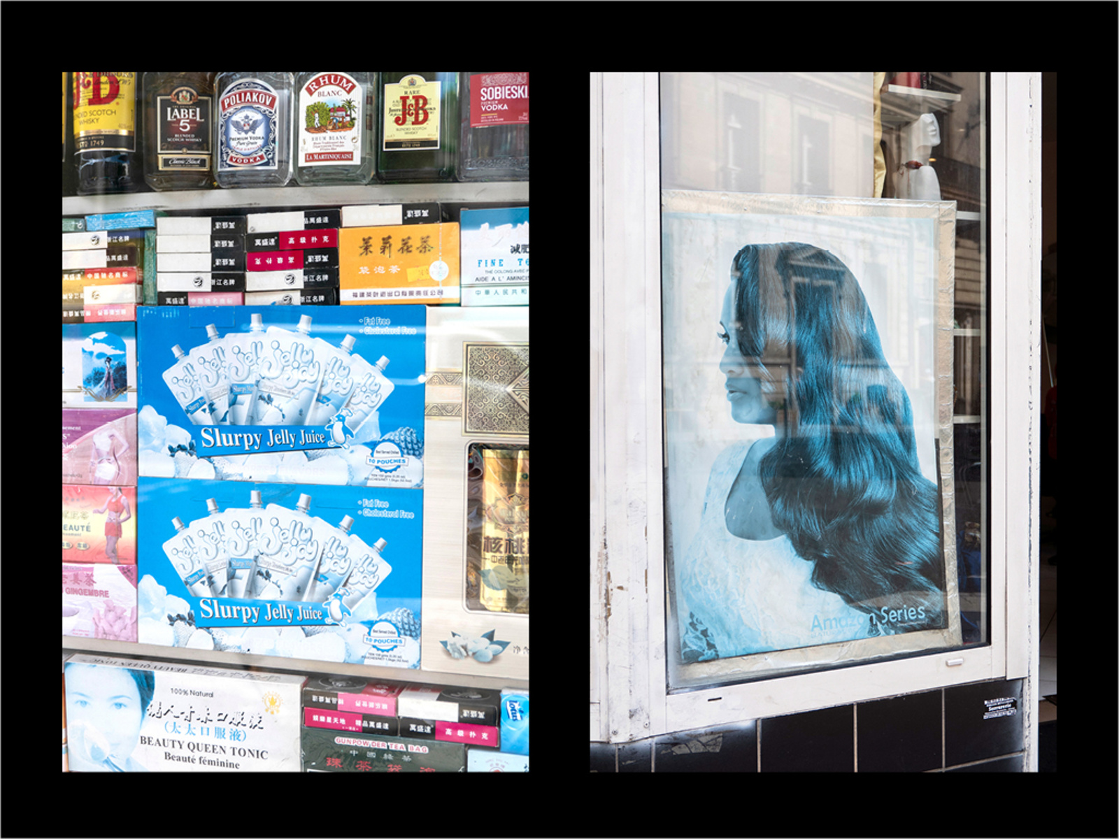
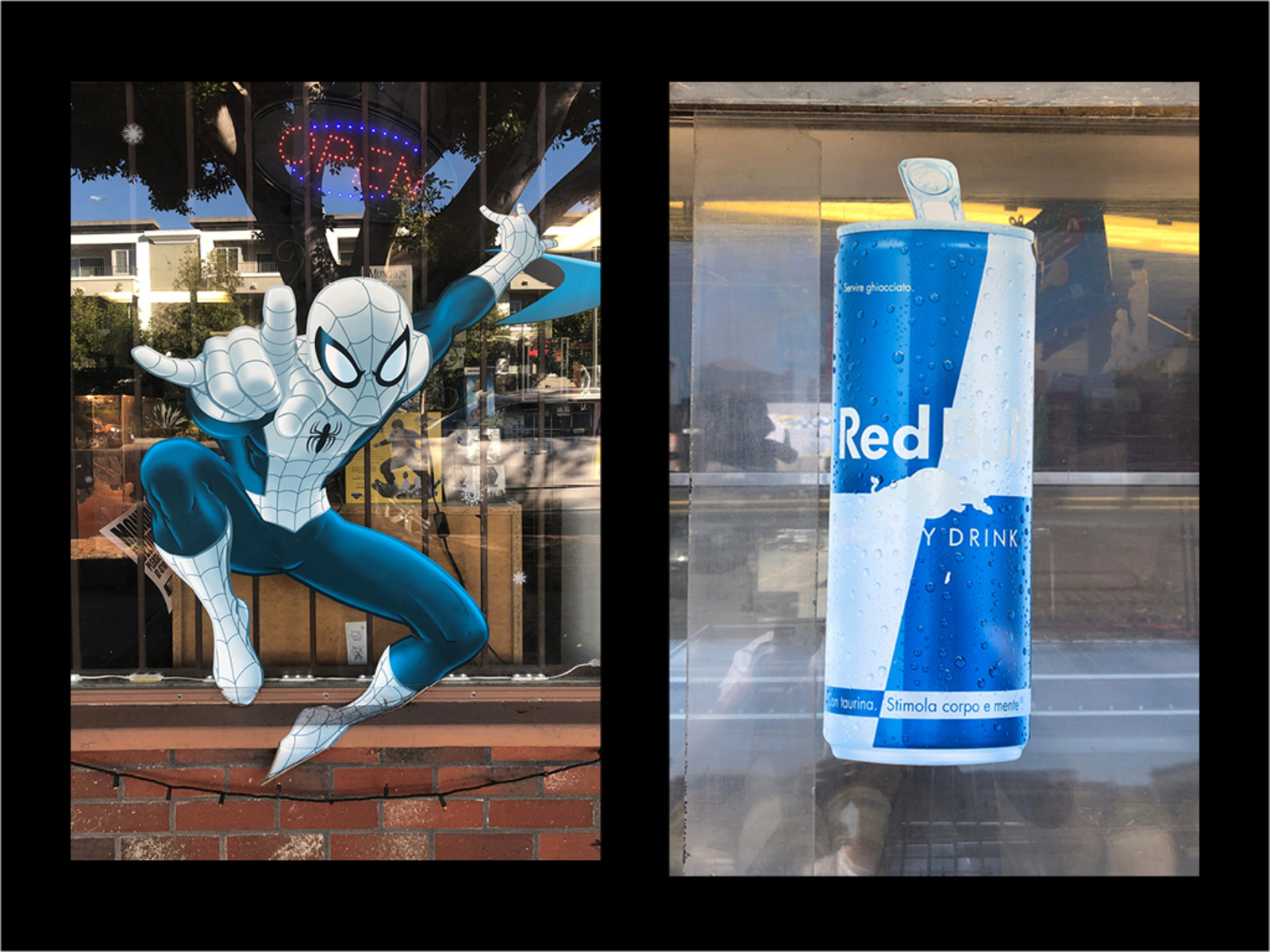
Image Cyan
Due to their inherent chemical compositions, different printing inks fade at different rates when exposed to UV rays. With the standard CMYK print combination, both Magenta and Yellow are the first inks to fade in sunlight. If images are left in the sun long enough they will eventually transform into a washed out blue afterimage.

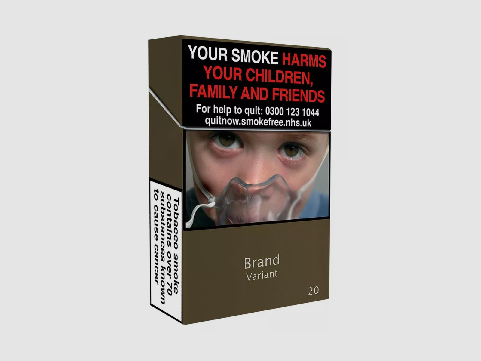
Drab Dark Brown
PMS 448, described as a “drab dark brown” or “opaque couché,” was voted the ugliest color in the world in a marketing survey from the Australian government. The Australian Department of Health intially called the shade “olive green” but was forced to re-name it due to complaints from the Australian Olive Association. As a result of their findings, the government made PMS 448 the color for cigarette and tobacco packaging in attempts to deter potential consumers. Since the survey Canada, France, the United Kingdom, Ireland, Israel, Norway, New Zealand, Slovenia, Saudi Arabia, Uruguay, Thailand, Singapore, Turkey, Belgium, and the Netherlands have all changed the color of tobacco packaging to “drab dark brown.”

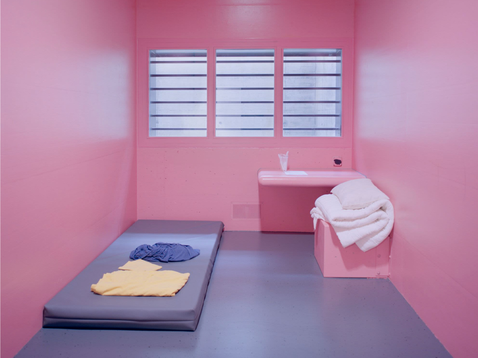
Photo: Angélique Stehli
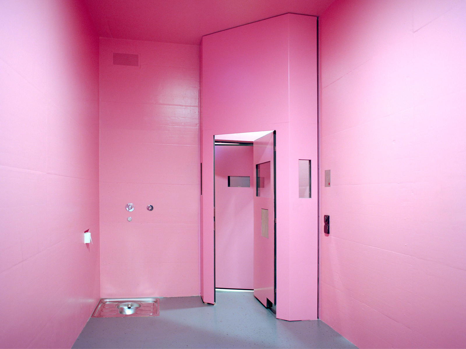
Photo: Angélique Stehli
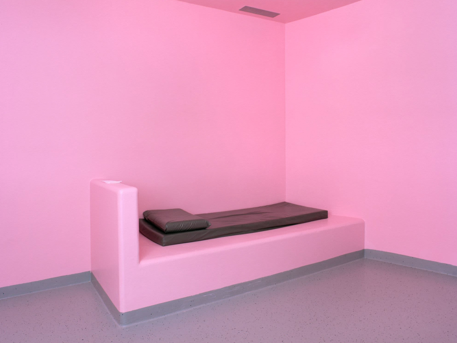
Photo: Angélique Stehli
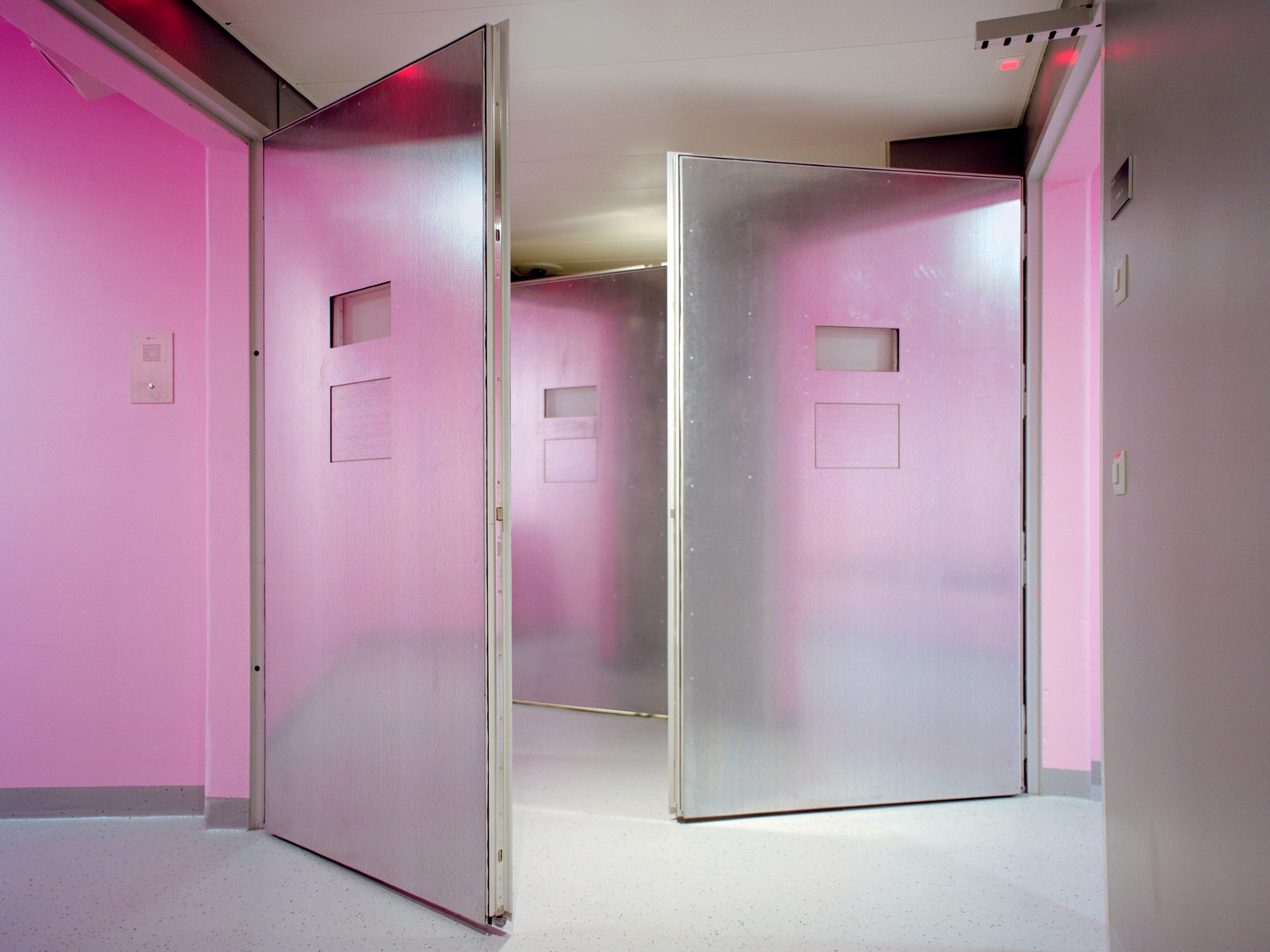
Photo: Angélique Stehli
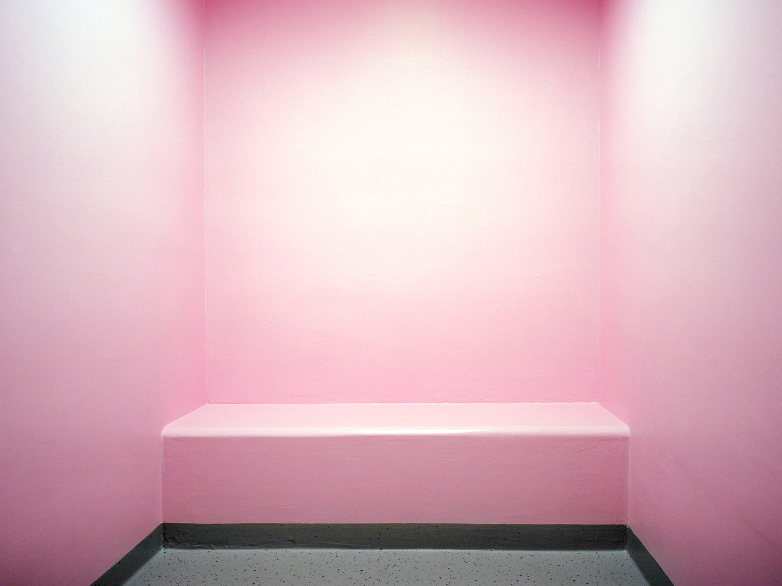
Photo: Angélique Stehli
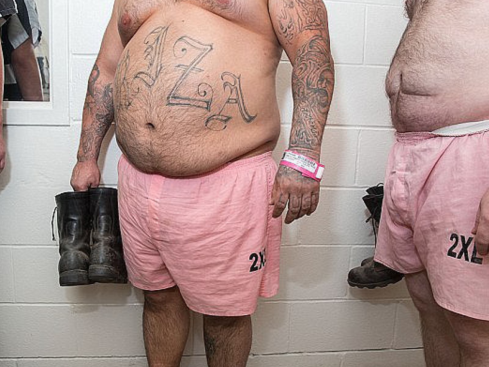
Drunk Tank Pink
Drunk Tank Pink (255, 145, 175), also known as Baker Miller Pink, is a color proven to reduce hostility, aggression, and anger. In 1979, researcher Alexander Schauss tested the color in a Seattle correctional facility by painting certain cells Baker Miller Pink. His results found a reduced rate of unruly behavior after as little as 15 minutes of exposure. The nickname “Drunk Tank Pink” refers to a potential use of the color in jail holding cells to calm down incoming, inebriated individuals. In 1991, University of Hawaii coach George Lumkin painted the visiting team’s locker rooms Baker Miller Pink in an attempt to make the opposing teams more subdued.

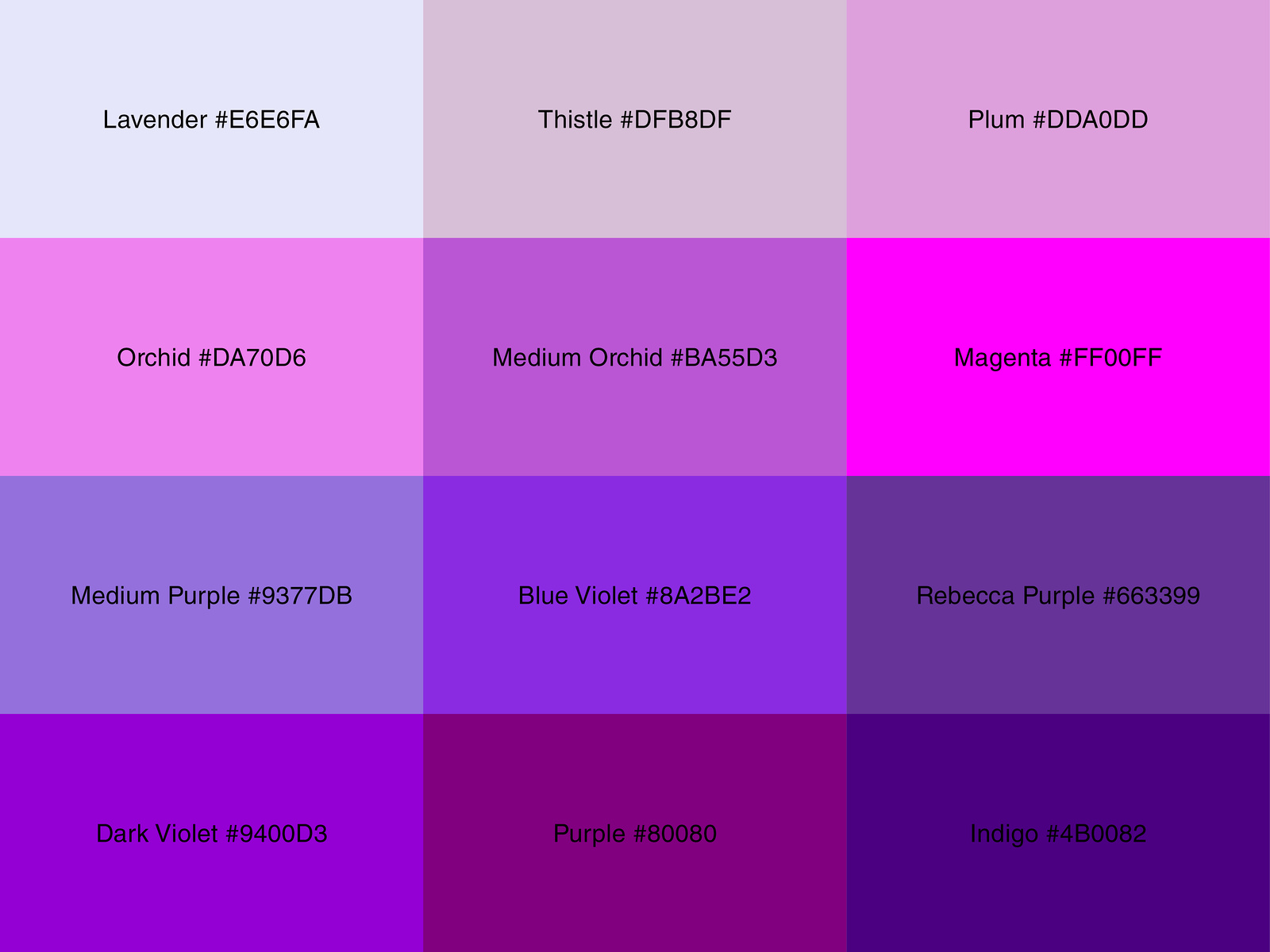
#rebeccapurple
While working on CSS standards, developer Eric Meyer’s daughter Rebecca tragically passed away from cancer. As a show of support, one of his colleagues created the Twitter hashtag #663399Becca which would allow people to share memories of Rebecca’s life. The campaign went viral, and as Meyer and his colleagues were naming web colors they decided to forever memorialize Rebecca in web browsers everywhere with the color #663399 by naming it “rebeccapurple.”

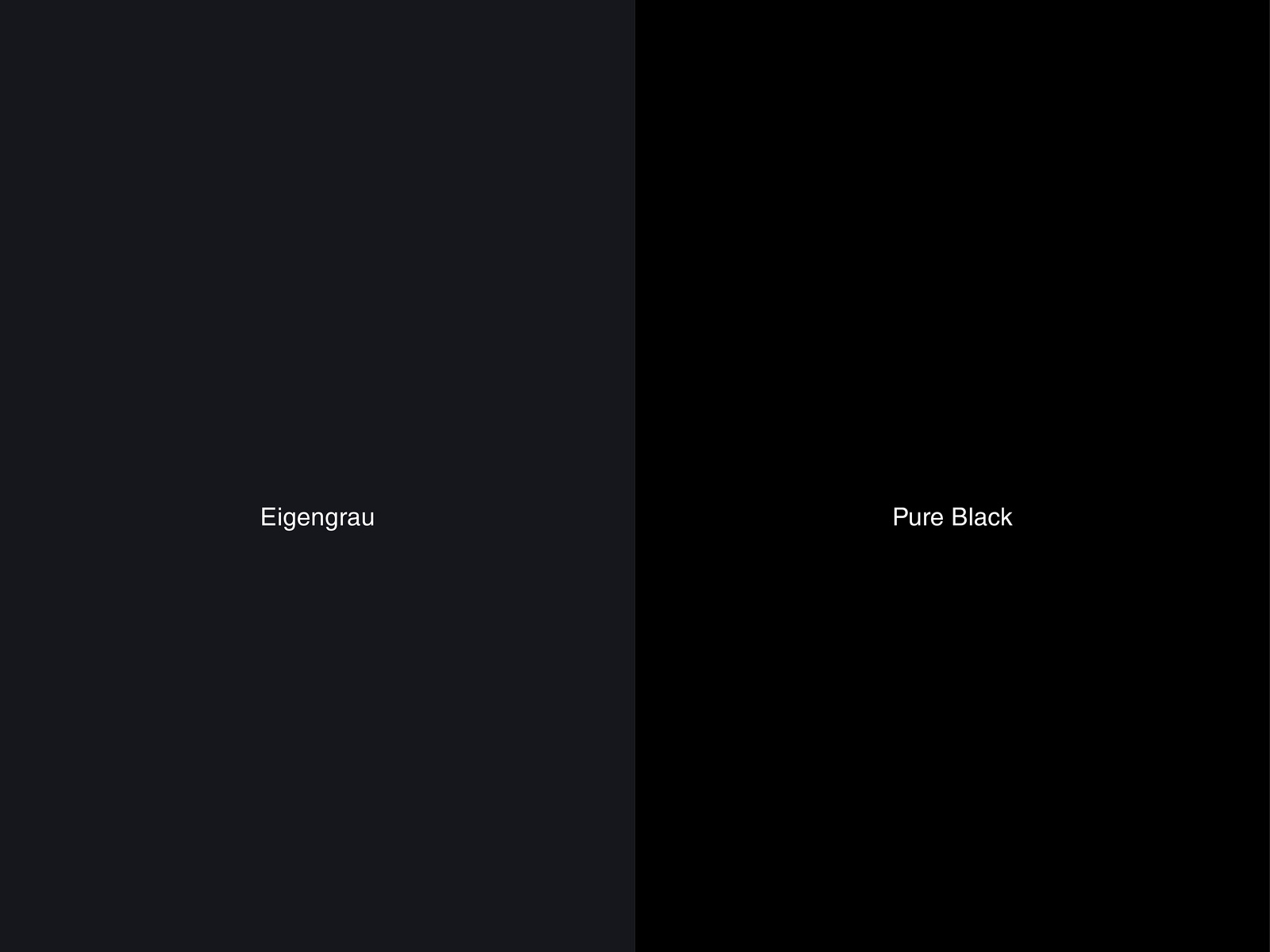
Eigengrau
Eigengrau, which roughly translates to “intrisnic grey” or “own grey,” is the dark color that appears when you shut your eyes. Scientifically, the hue is often referred to as “visual noise,” “dark noise,” or “background adaptation.” The color is proof that even with our eyes closed our retina does not totally shut down but is intaking the minimal amount of visual stimuli and outputting it as “Eigengrau.”

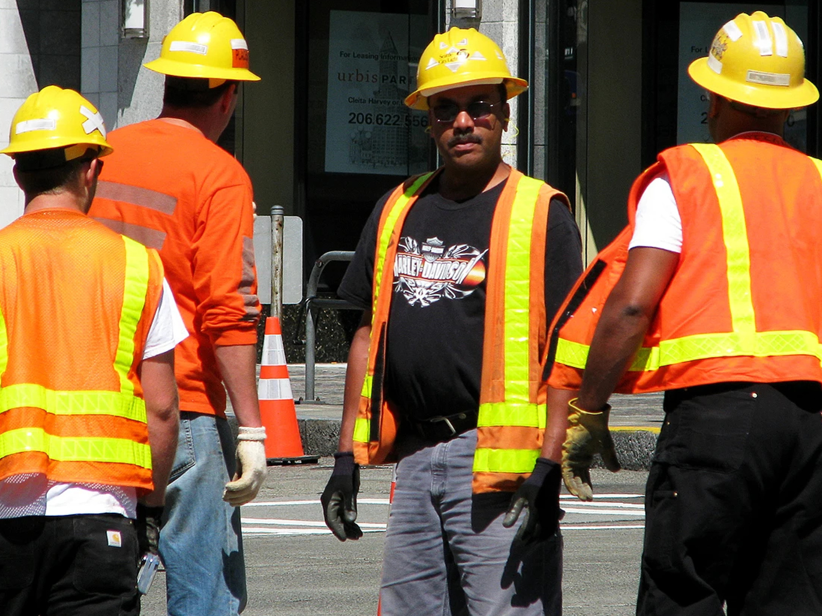

Safety Orange
“Safety Orange” (also known as “Blaze Orange”) is a universal standard meant to draw attention to potential danger commonly found on construction sites, wood shops, road work, and on the tips of replica guns like airsoft rifles. The color is regulated by the government agency OSHA, and was chosen as an alert color due to its direct contrast with the sky. Perhaps due to its association with traffic cones, and thus traffic jams, orange is the “most common least favorite color.”1“https://www.theparisreview.org/blog/2018/10/31/blaze-orange-the-color-of-fear-warnings-and-the-artificial/”

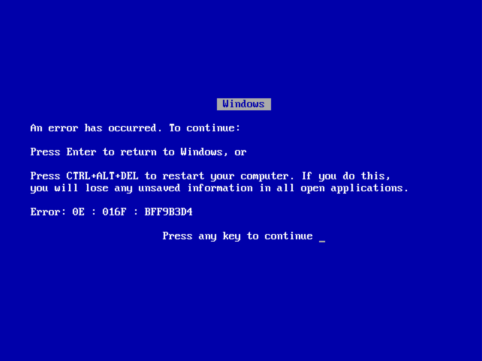
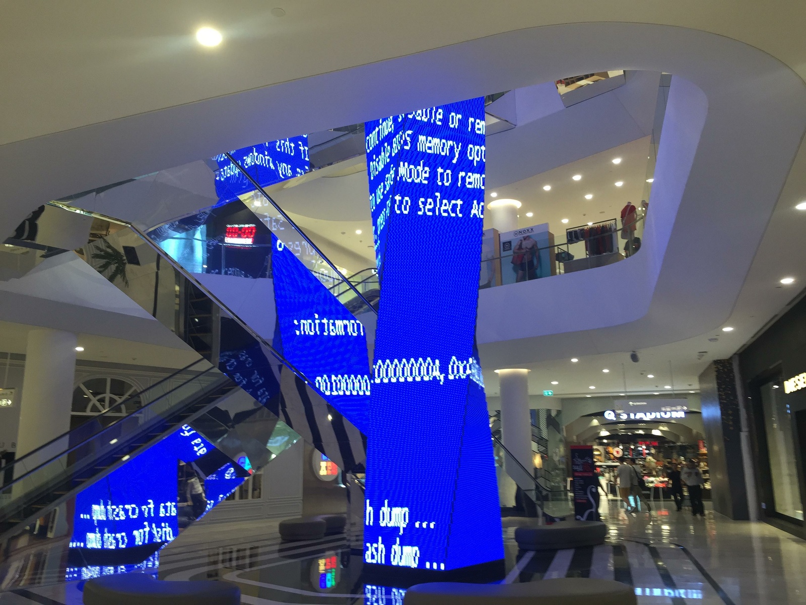
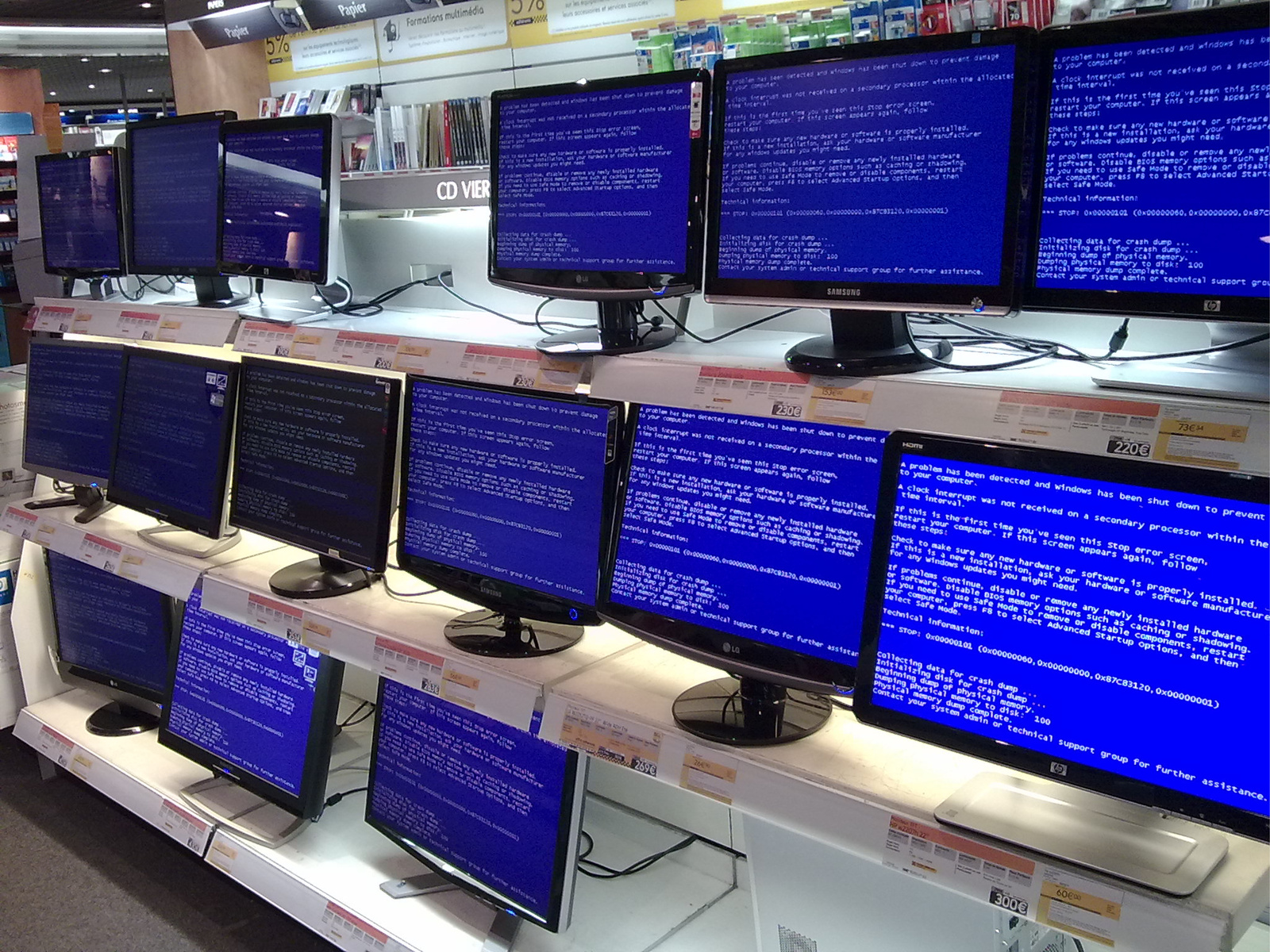
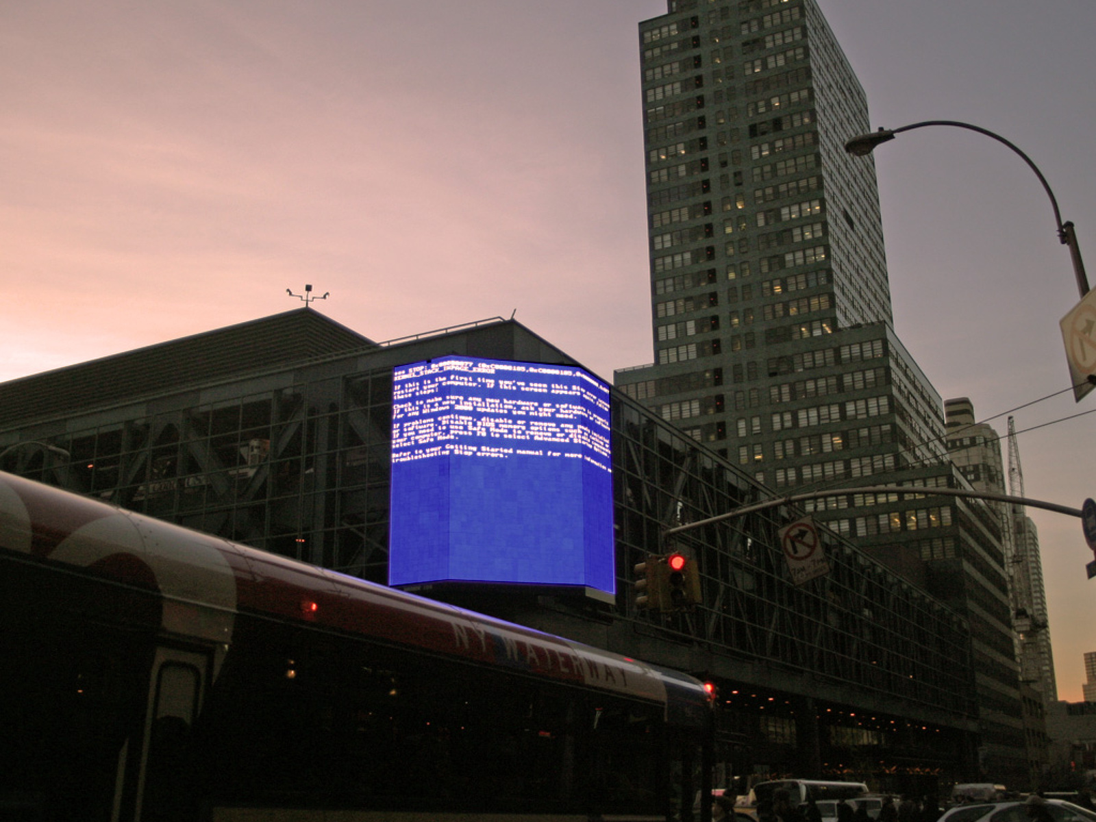
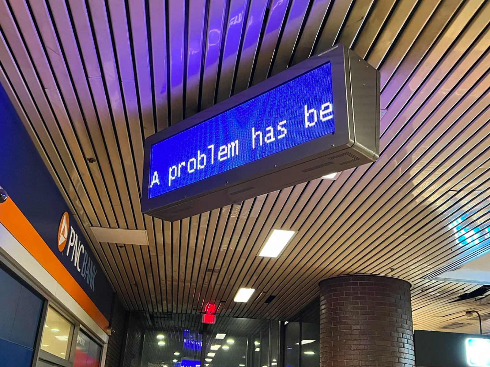
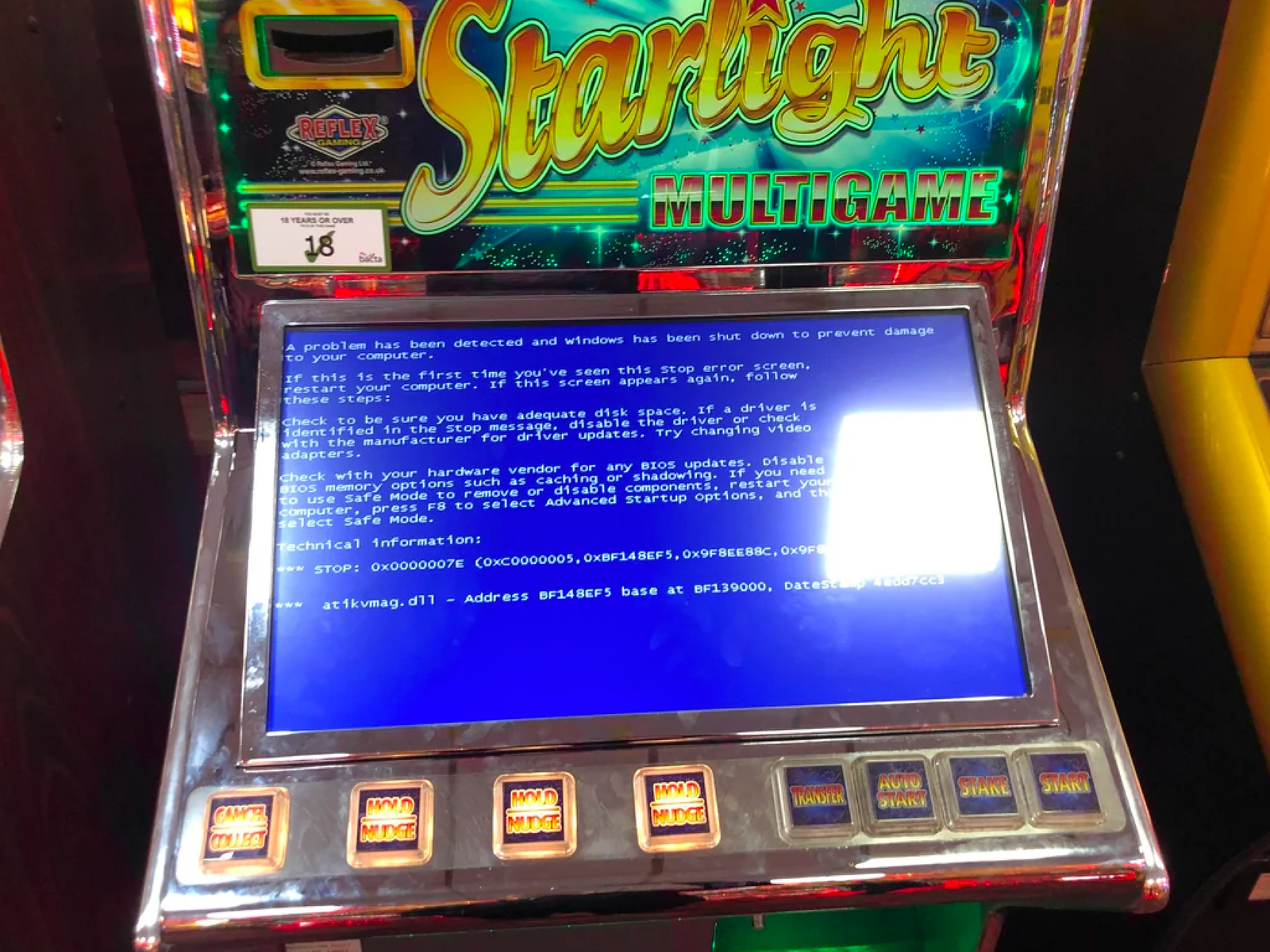
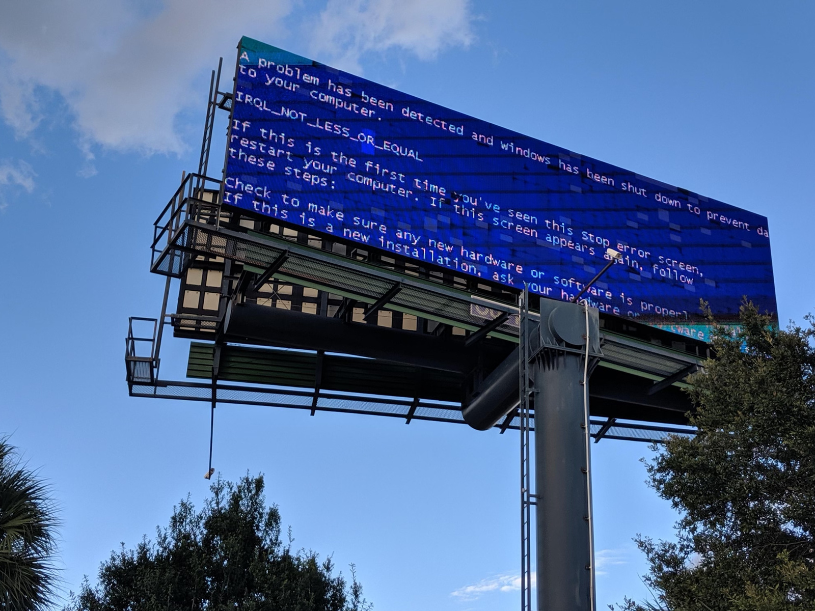
Blue Screen of Death
The “Blue Screen of Death” (BSoD), technically known as a stop error, occurs when a device has an unfixable issue and must shut itself down. Blue was chosen based on the color pallete (white text on an RGB blue background) of the initial programming software, SlickEdit, used by Microsoft developer John Vert in 2009. Today several companies have re-colored their error screens, such as X-Box, which displays a green screen when an unfixable problem with the machine has occured.

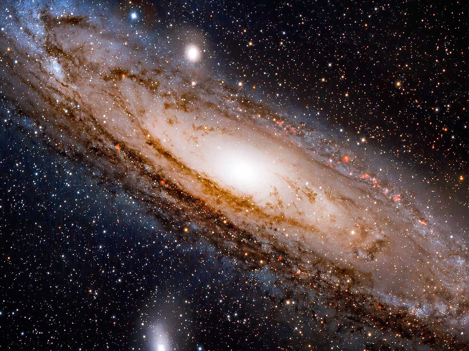
Cosmic Latte
According to a Johns Hopkins University study, “Cosmic Latte” is the average color of the universe as viewed from Earth. The color is a result of the light from stars, gas, and dust from distant galaxies. As stars age and turn from blue to yellow to red, the light from the universe takes on an overall beige-like color. The name of the color was the result of a contest between astronomers in the study, “Cosmic Latte” beating out entries such as “Big Bang Buff,” “Astronomer Almond,” “Cosmic Khaki,” and “Primordial Clam Chowder.”

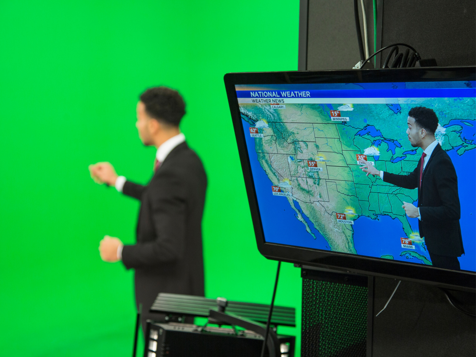
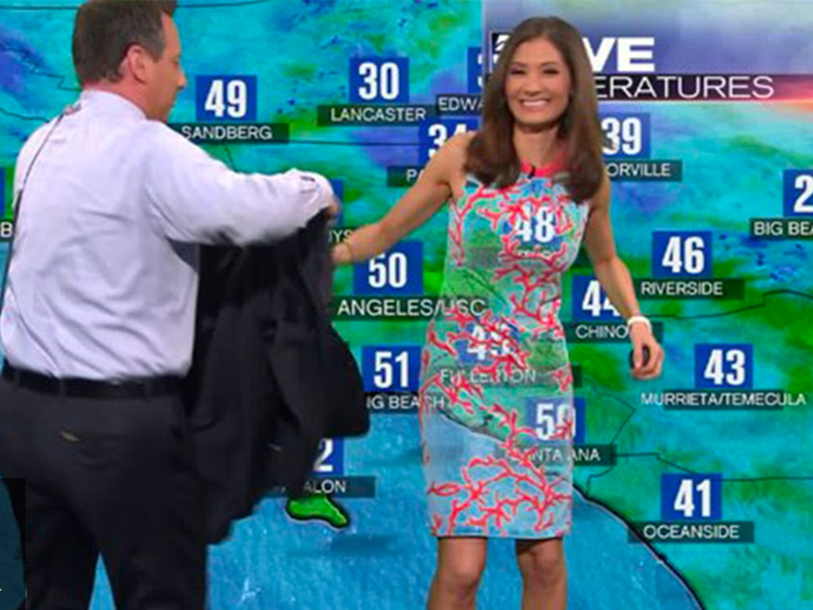
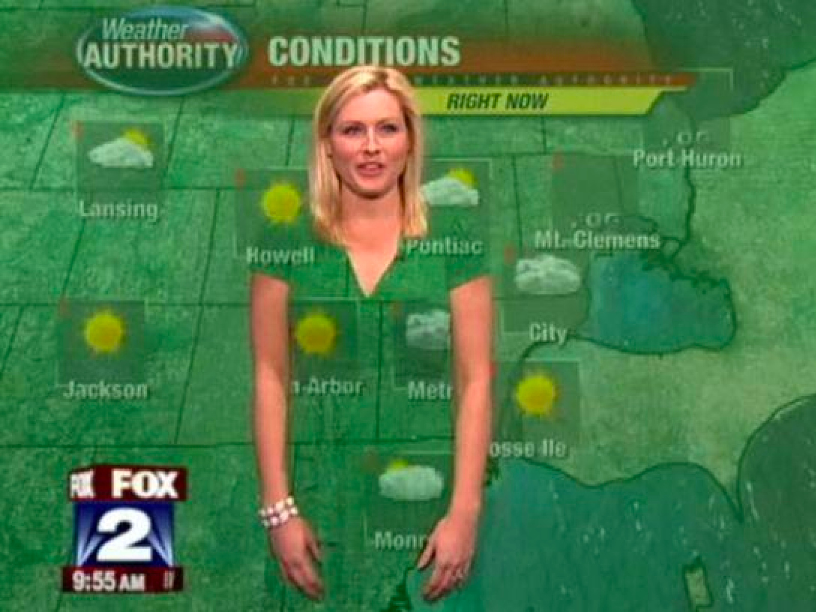
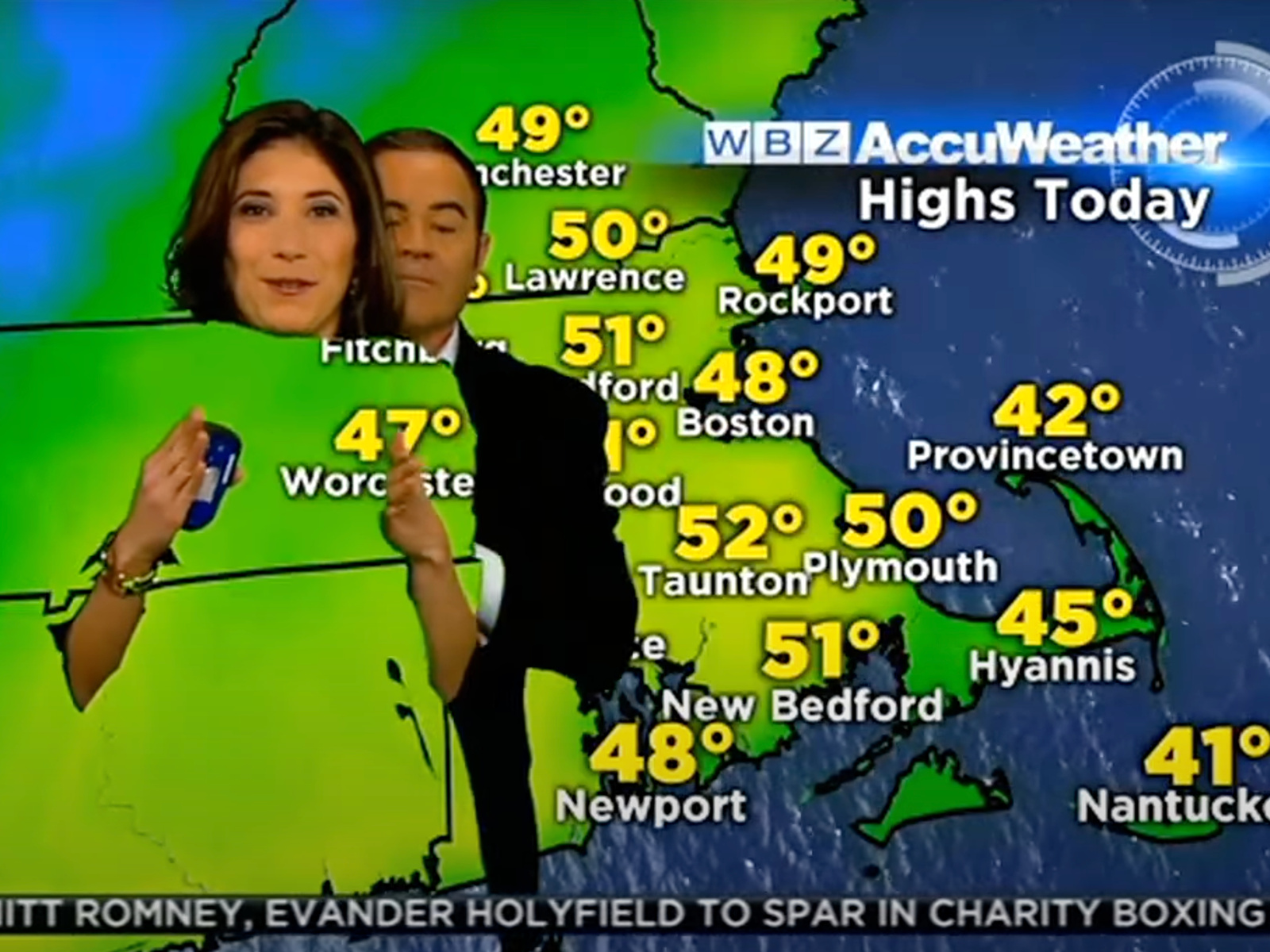
Green Screen
“Green screen” is a method of compositing two or more pieces of footage in post-production. The technique, widely used today, didn’t actually begin green, but blue. Blue screen began in the 1930s but was later replaced with green, especially in TV production. For the compositing process to workout it is necessary for the color of the screen to be distinct from the figure (such as a weather reporter) standing in front of it. However at the time, weather reporters often wore blue suits, blending in with the background. Thus, green became the more popular option.

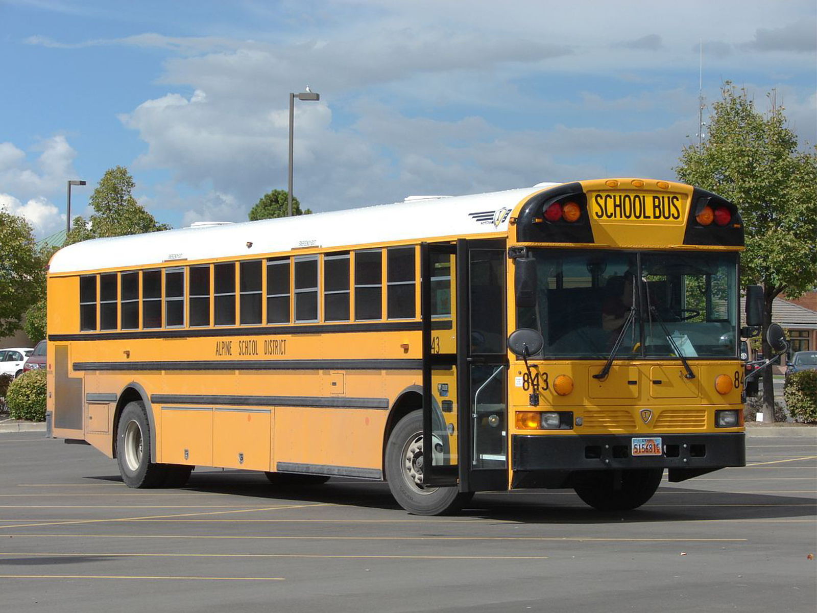
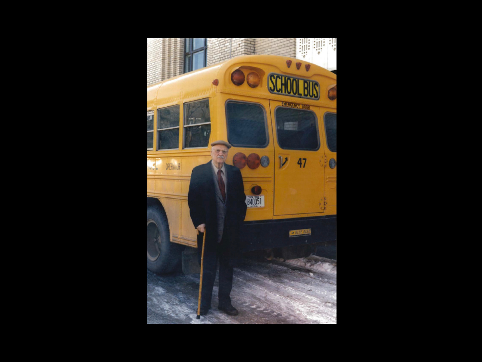
School Bus Yellow
In 1939, Dr. Frank Cyr hosted a conference with transporation officials from 48 different states to decide upon regulatins across national school districs. One such decision that was made was choosing a yellow-orange color for all school buses across the US. “School Bus Yellow,” as the hue would later become known, was chosen due to its high contrast with black type and the peculiarity of seeing a large yellow vehicle on the road. The decision earned Cyr the nickname “Father of the Yellow School Bus”.


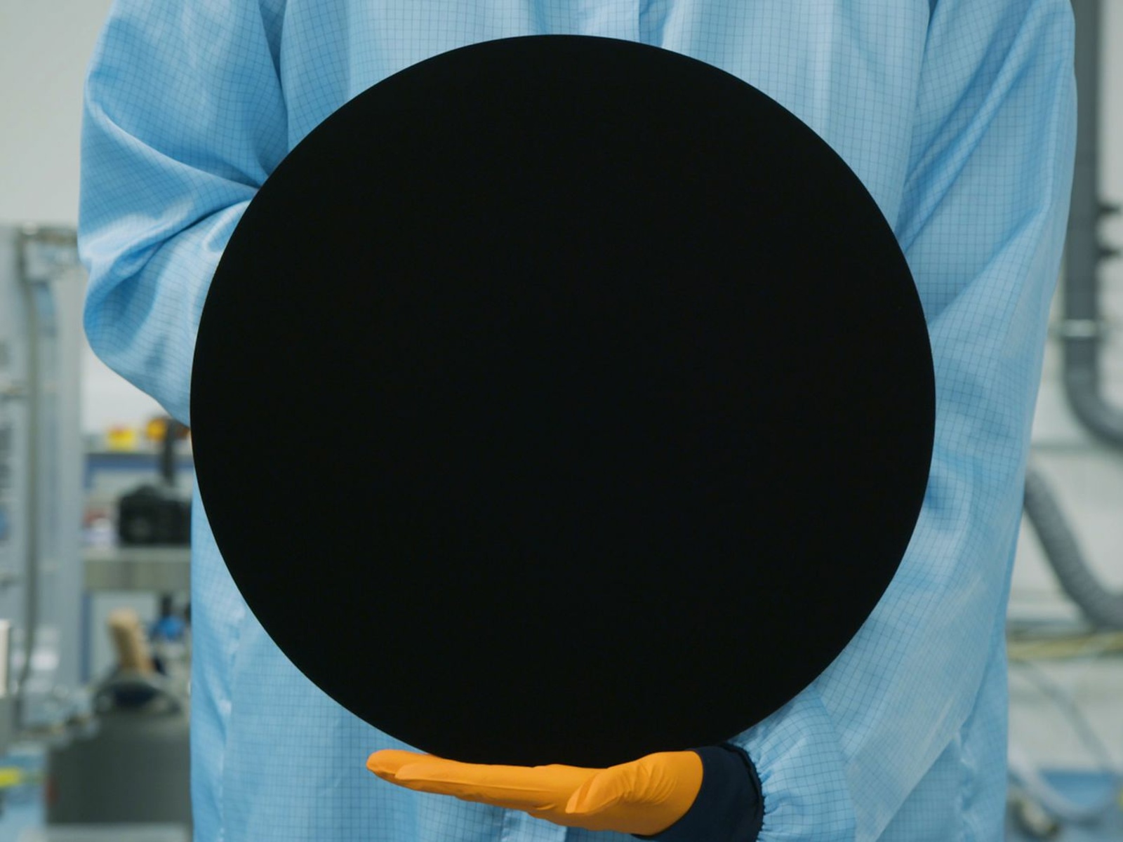
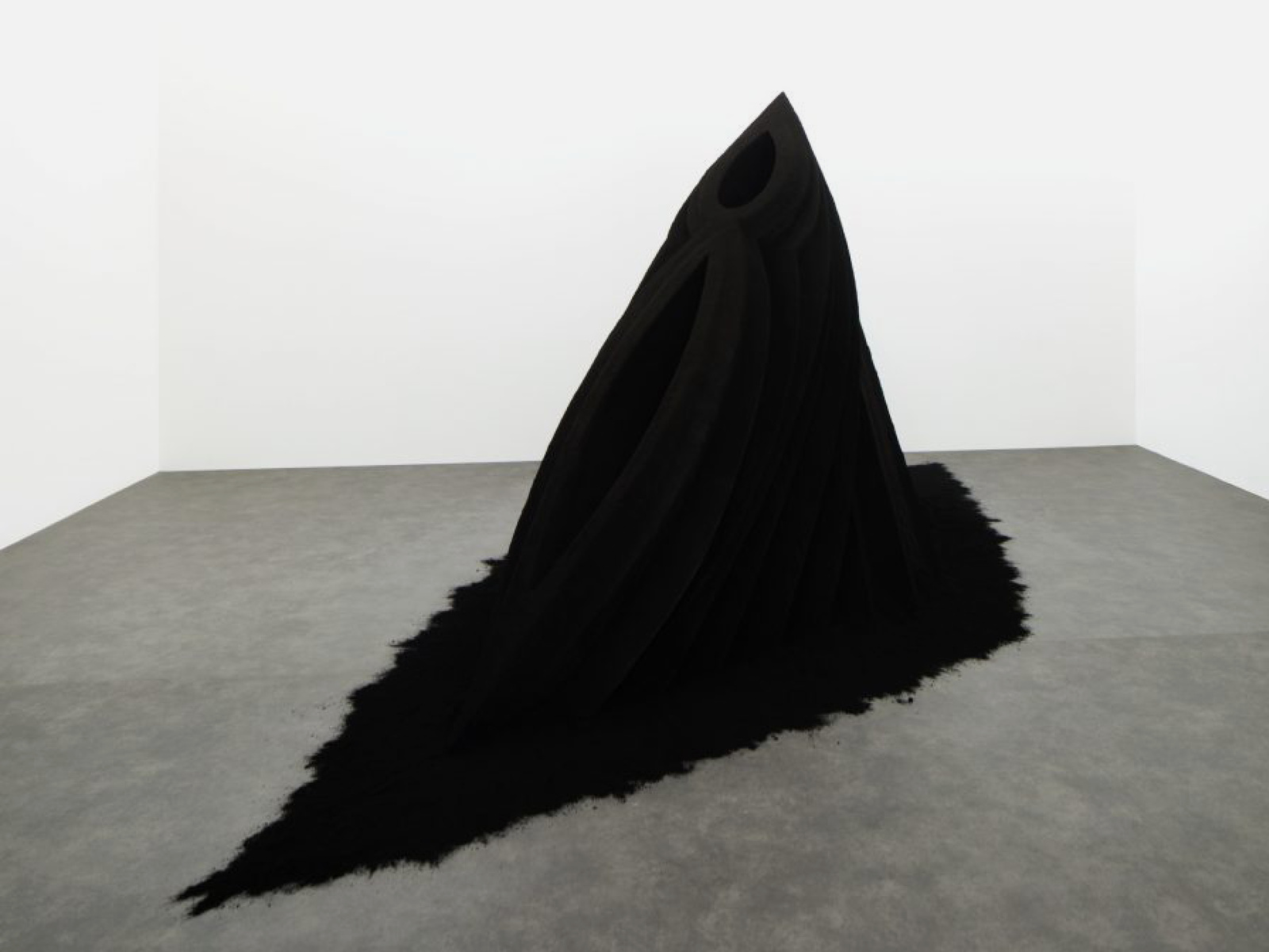
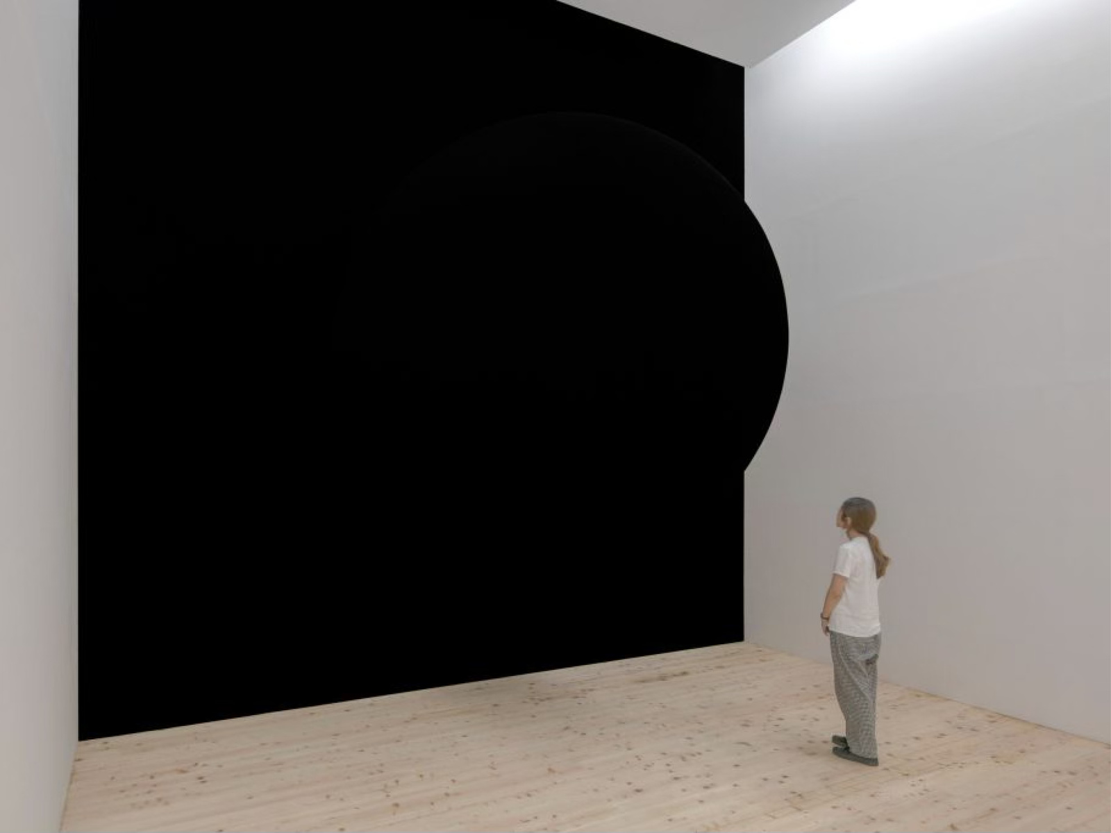
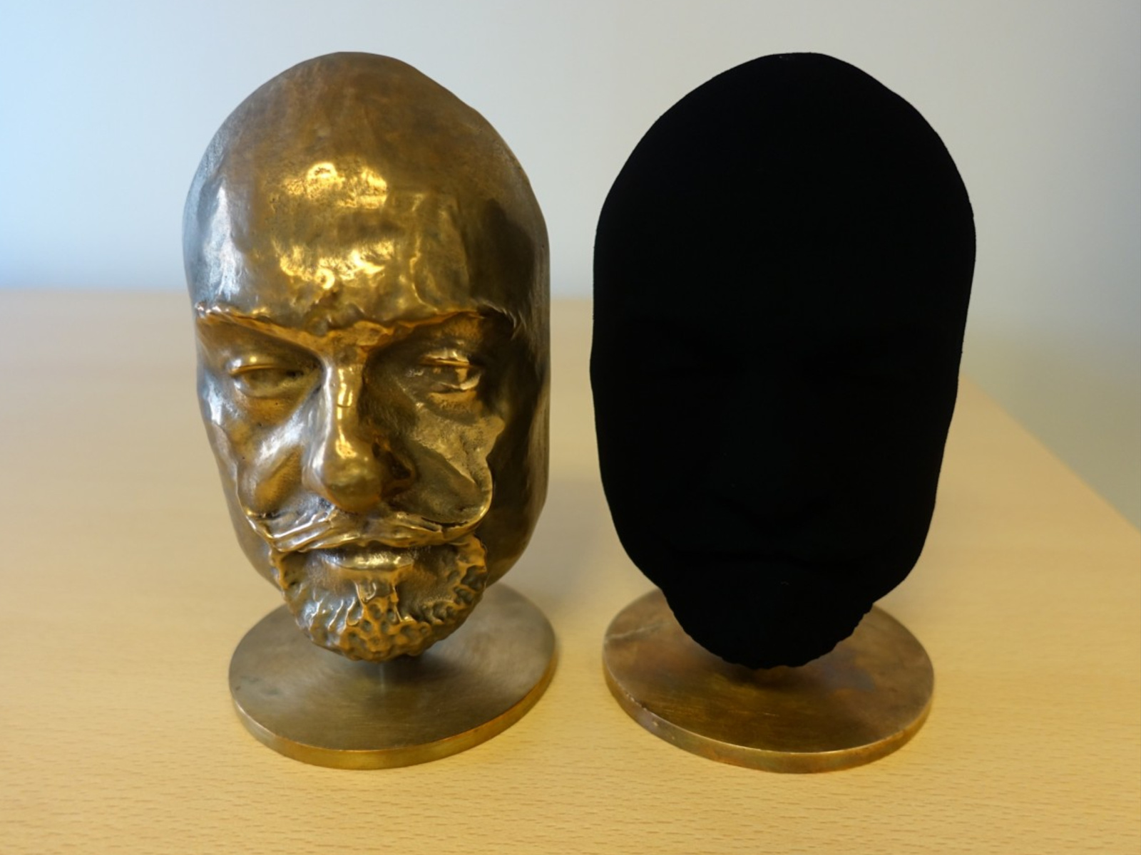
Vantablack
“Vantablack” claims to be the “worlds darkest material” absorbing 99.965% of visible light. The color landed in controversy after its developer, Surrey Nanosystems, granted the artist Anish Kapoor exclusive rights to use the shade in his works. In response, a competing laboratory, Nanolab, created a black paint called “Singularity Black” with similar properties to “Vantablack” but with access for all.

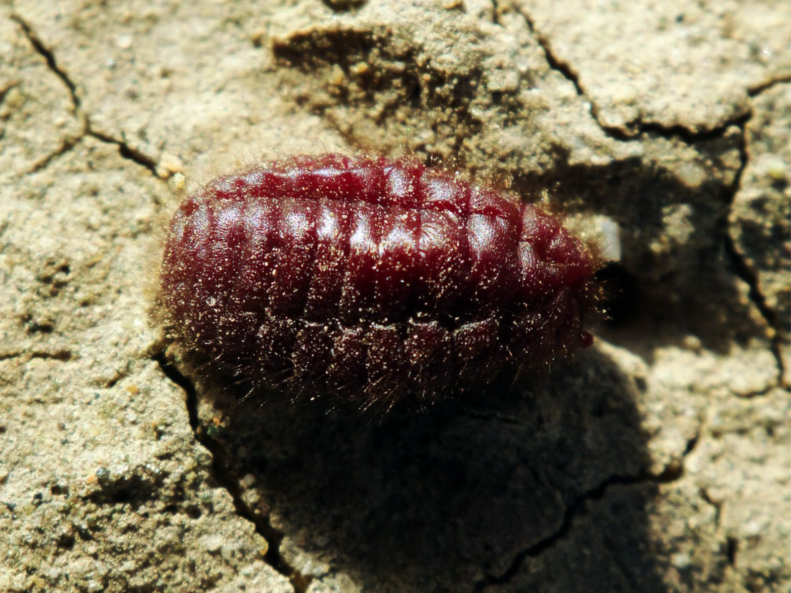
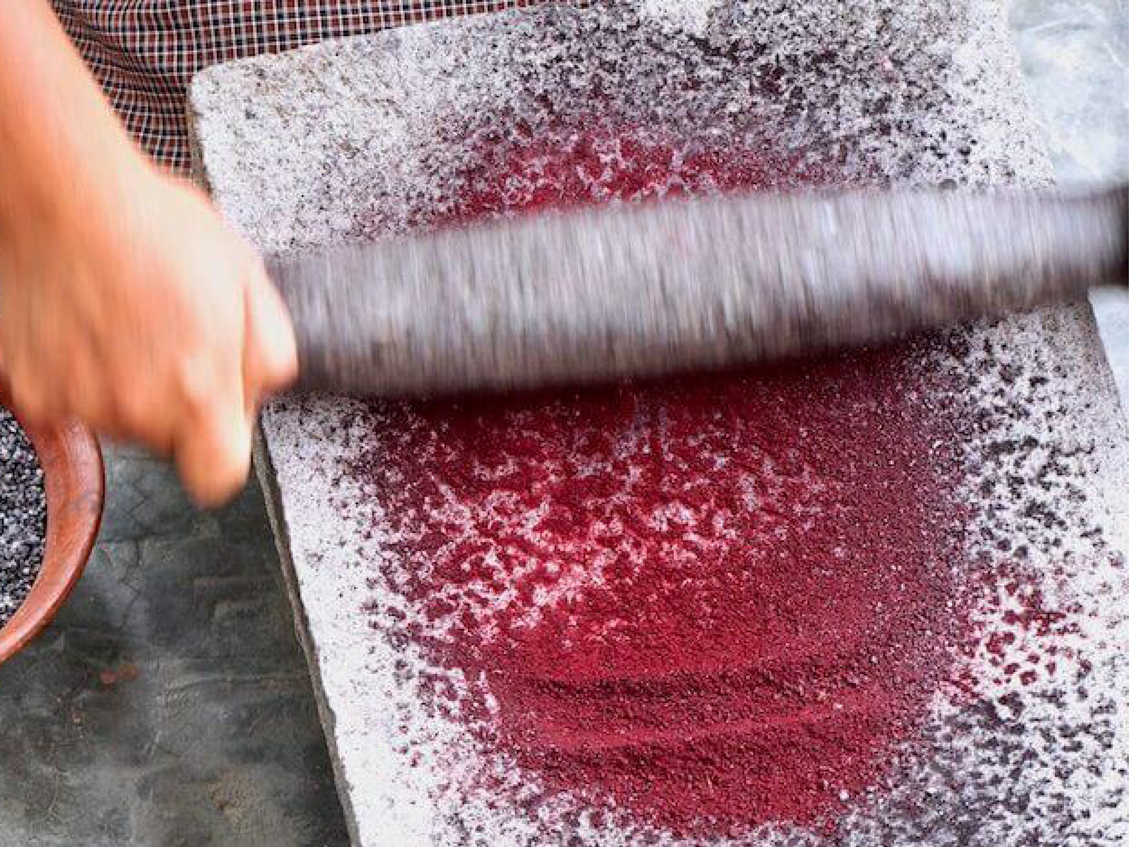
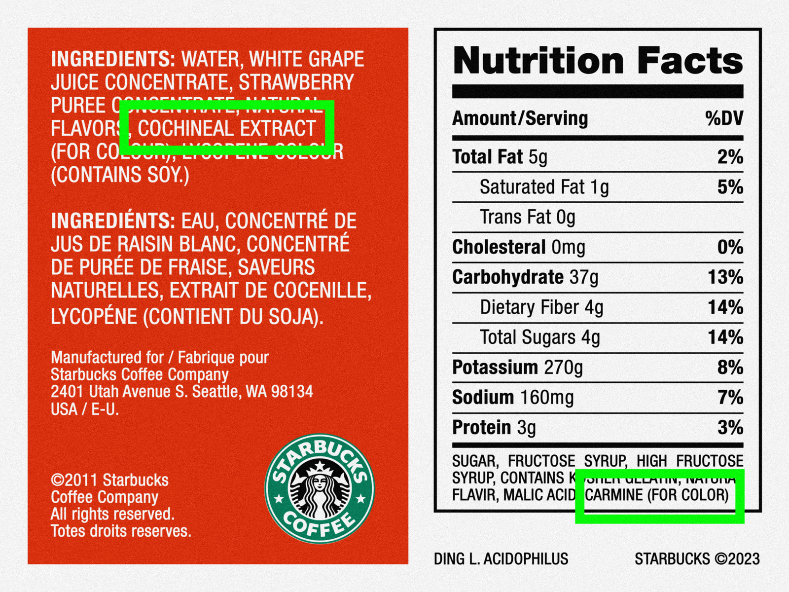
Carmine Red
“Carmine Red” is one of the most widely used hues in the food coloring industry. The popular dye is made from crushed up cochineal, an insect predominately found in Peru. Cochineal was first used by the Mayans and Aztecs over five centuries ago and gained popularity due to it being a healthy alternative to artificial products. Most recently, as demand for vegan food alternatives skyrocket, companies such as Starbucks, who previously used cohineal, have looked for other natural red dyes such as lycopene, a tomato extract.