Alloy Futures:
On Contrast, Heavy Typography & Hard Aesthetics
About 60 miles east of Los Angeles in San Bernardino County, is the town of Fontana, a place described by Mike Davis in City of Quartz as “a loud, brawling mosaic of working class culture.” More than what Davis describes as the “roughest town in the country,” however, Fontana is also a junkyard utopia, where the offruns of industry are laid to rest only to be reborn again and again.
Under the slogan “From Pigs to Pig Iron! Fontana Steel Will Build a New World!” the American industrialist Henry J. Kaiser set out to transform the rural farming community into a steel-making war-machine that would supply the Pacific Coast shipbuilding industry with steel. In 1942, the first integrated steel-making mill on the West Coast was established: Kaiser Steel. The logo is made up of white, robust, square, and slightly forward-leaning letters on a piercing red background, signalling the vitality of the venture. Modern life was rushing forward.
Until it wasn’t. An alloy of global overproduction, neglected modernization, increased competition from technologically-superior Asian and European steelmakers, and an unfavorably strong dollar caused Kaiser Steel to declare bankruptcy in 1987, leaving thousands of workers unemployed. Most of the plant was torn down and sold, other parts were left to its own providence. But the Kaiser Steel plant would soon reappear. In 1990, principal photography for the film Terminator 2: Judgement Day began, with the Fontana plant as the cardinal location. Once lost to technologization, the plant briefly became the site for artificial intelligence, mimetic polyalloy liquid metal, and androids.
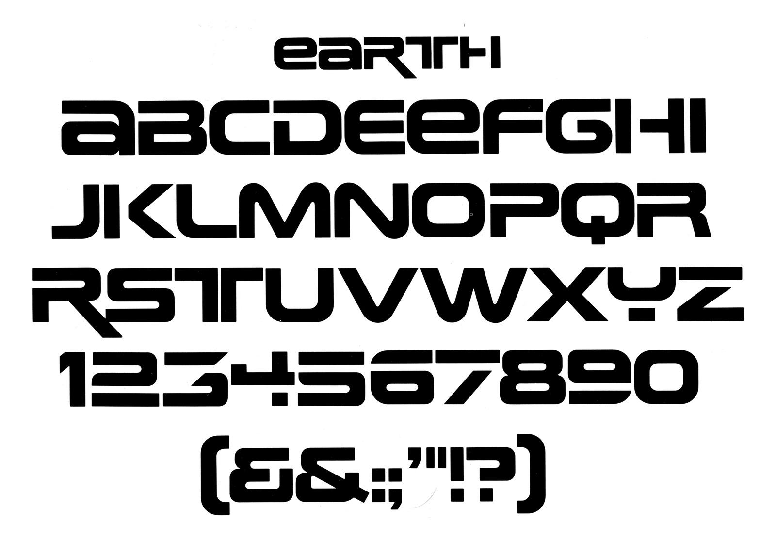
Earth (c. 1970), designer unknown
The distinct, blocky typography of Terminator signals the future, but draws from the past. Terminator T-1000 was sent back in time by Skynet in 2029, but the typeface used for the Terminator titling and universe is a modified version of a phototype known in pre-digital form as Earth from the 1970s, designer unknown. The US economy sank into recession in 1990, with unemployment still high from the decline in manufacturing jobs of the 1980s and not yet affected by the technological boom that was going to create the “Roaring Nineties” later in the decade, a kind of productivity interregnum. With one foot in the past and one in the future, Terminator 2 waddles through the rubble and borrows the bygone site and style of Kaiser Steel, but melts it down again into something disconnected and patchy–two worlds at once. The letters are still robust and square, but fluid, as if they’re starting to slip away from the grit and grime of the times. On the official movie poster, the capital ‘A’ in Arnold Schwarzenegger’s name leans forward, but backwards in the film’s title. The future is highly technological, but still made from the metals of yesterday.

Movie poster, Terminator 2: Judgement Day (1991)
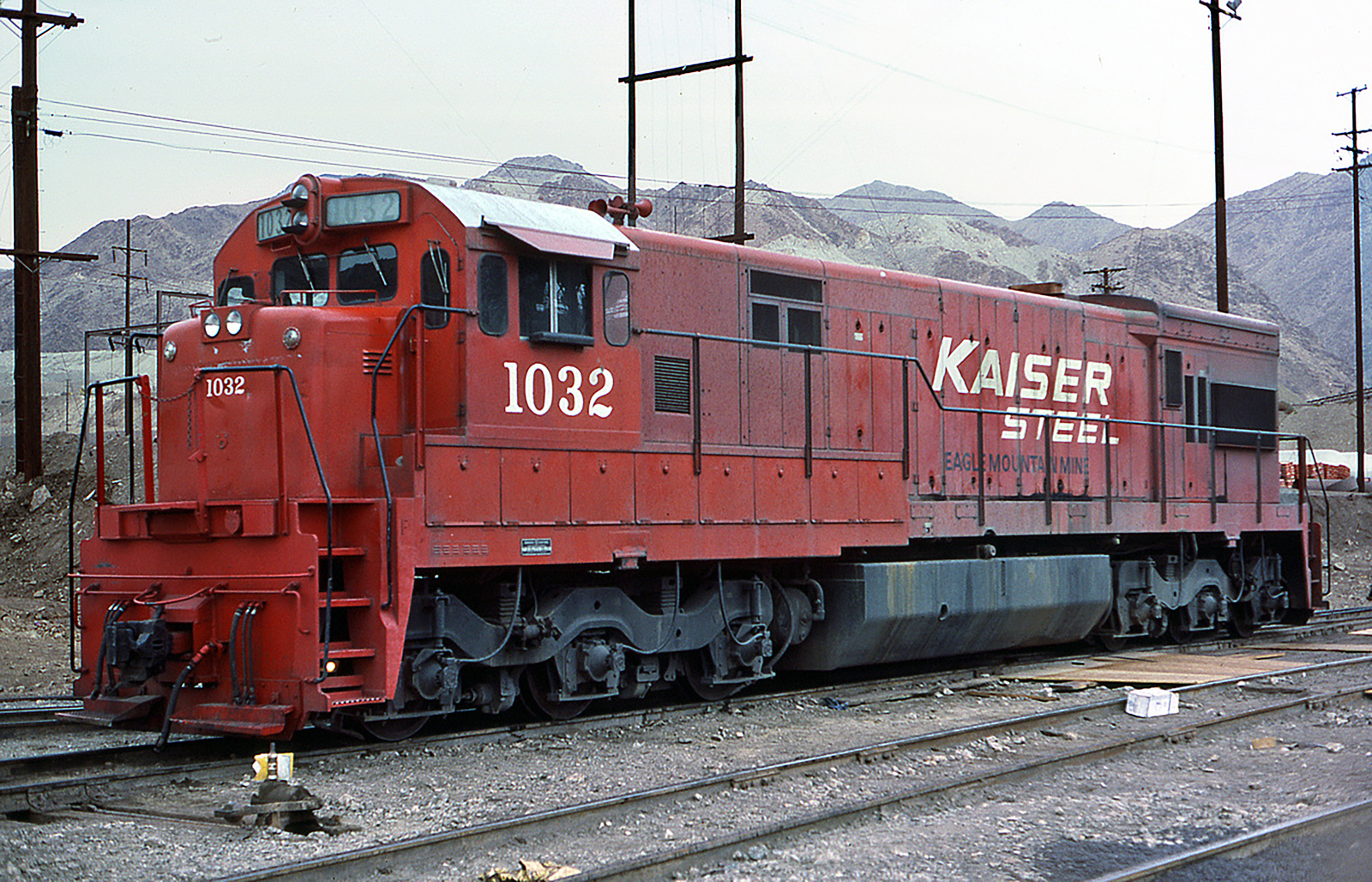
Kaiser Steel Train, Photograph: Joe Blackwell
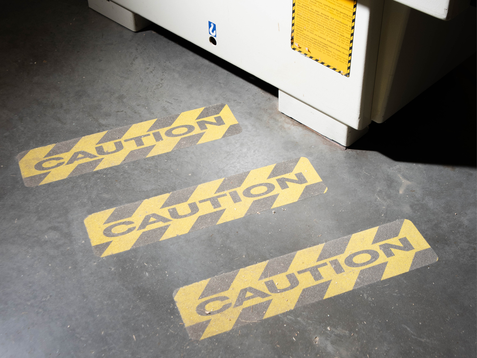
In type design, “contrast” usually refers to the relationship between the thinner horizontal strokes and wider, heavier vertical strokes–the bigger the difference the higher the contrast. It can also mean a play with the opposite, as in a reverse-contrast typeface. But in factories like Fontana, contrast is a whole system of signals and warnings: a universe of safety and sense-making based on stipulations from the International Organization for Standardization (ISO), the world’s largest developer of voluntary standards, and separate national organizations such as the American National Standards Institute (ANSI).
Industrial workshops and other areas for production are often filled with stationary machinery in muted greens or blues, blending in under layers of dirt and dust and production discharge. Floors are speckled with paint flakes to camouflage stains. In this environment, moving machinery such as forklifts need to be spotted quickly and are therefore usually painted in a color from the palette of contrasting safety colors, most commonly “Signal Yellow” (Pantone 109C). Signal Yellow is designated to mean “warning” according to the ISO standard. Signal Red means “danger,” Signal Green “safety.”
ISO outlines other forms of signals as well, all defined by opposites. An acoustic signal, for example, is a contrast in frequency and intensity, or type of sound (“sound level that is perceptibly higher than the level of ambient noise” or “easily recognizable, particularly in terms of pulse length and the interval between pulses or groups of pulses”). A tactile signal is created by patterned detents and vibrations contrasting the tactility inherent to the machinery used.
But the use of high-contrasting color combinations to indicate danger is hardly unique to the workshop: poisonous animals have long learned to use contrast to advertise their toxicity, to both save and be saved. This practice of warning others to stay away is known as aposematism, a term coined by the English zoologist Edward Bagnall Poulton in his 1890 book The Colours of Animals and based on the Ancient Greek words ἀπό apo “away” and σῆμα sēma “sign.”

This frog uses aposematism to warn other animals of its toxicity.
Taking cues from this history and inspired by hard club music, an alternative way of looking at contrast in type design and aesthetics might be one in which the contrast isn’t in the letters themselves, or just in opposites of the color wheel and in theory books. Rather, the strokes would be as heavy as possible all the way around, colors contrasting the backdrops of the landscapes around them and inverse the spectrums they project back. A chromatic, sturdy, “hard aesthetics” when the foundation of industrialization is rusting, turning history on its head to signal an alternative future.

Signal Green and Signal Yellow in use. Photograph by Dylan Beckman
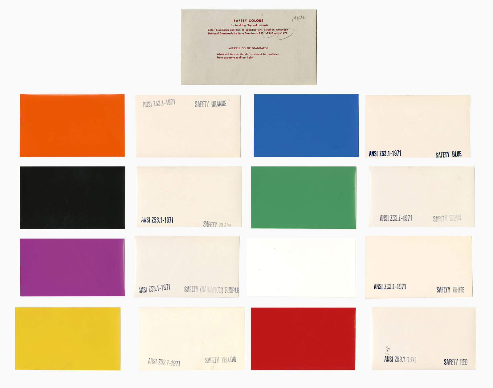
Munsell Color, Safety Colors for Marking Physical Hazards (1971)
A few years after the Terminator took over Kaiser Steel, once again left to corrosion and blight, the site went through another transition. Similar to the transformation of abandoned buildings and factories into spaces for clubs and raves happening across post-industrial cities in the ’80s and ’90s, illegal parties under the name Stargate brought the Fontana plant back from the dead in 1995 and 1996 with fury and ecstasy. Turning to the ruins of industrialism to escape the hyper-productivity of the emerging neoliberal era, raves became a site of both resistance and withdrawal from the myth of progress and productivity, but with an extreme, almost horrific speed, pre-empting the precarity to come. Michael Kosmal from ravetapes.com describes the site as “dark, dirty, and dangerous” and “a perfectly surreal environment” to see acts such as DJ Tron, the pioneering gabber, hardcore, and speedcore producer.

DJ Tron live at Stargate, September 16, 1995. Image Courtesy of Ravetapes.com
The flyer for the 1995 party that DJ Tron headlined is a shocking pink with round heavy letters with large gaping circular holes for the closed counterforms. The number 8 is straight up designed as a wrecking ball. The origins of the typeface are unknown, but it might be thought of as a version of Othmar Motter’s Motter Pretiosa from 1990 (originally named Ferrum, or Iron) put through an acid bath, leaving a degraded, freakish core. As far as aesthetics go, the psychedelic vibrancy of the Stargate flyers couldn’t be further from the rusting wreck of the steel plant, but they share the same robust hardness: a utopia not made out of just anything but of junkyard molten, contrasting decay and dust with saturation and intensity.
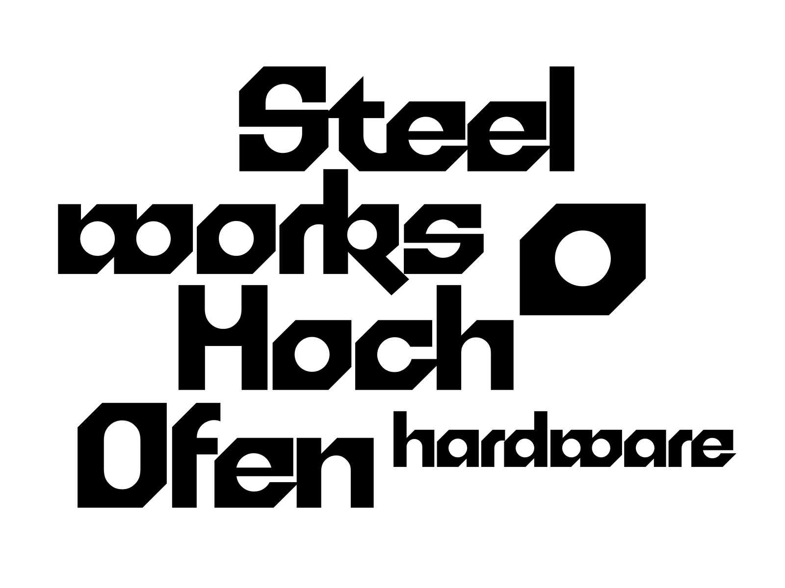
Motter Pretiosa (1990)

Stargate Flyer. Image Courtesy of Ravetapes.com
My hometown, Fagersta, is also defined by a steel plant: Fagersta Bruks AB, established in the late 19th century but on grounds that have been mined for iron since the Middle Ages. At its peak, it was one of the finest and most profitable steelworks in all of Sweden. But despite its place in history, growing up there in the ’90s was different, similar to the decrepitude found in Fontana: glum, full of factory ruins, material surplus, refuse and the unfulfilled prospects of the Industrial North. In The Periodic Table Primo Levi writes that elements such as iron are “easy and direct, incapable of concealment.” Turns out you can’t hide the things iron leaves behind either. Holes remain in hearts and ground.
For reasons similar to the bankruptcy of Kaiser Steel, Fagersta Bruks AB was chopped up and sold the year before I was born, with the newer and more profitable parts shipped off overseas. One entity that was left was named Fagersta Stainless, specializing in stainless wire-thread; it’s also where I worked my first summers cleaning toilets and break rooms. The name always felt deeply ironic, stainless, when the whole place was so broken and dirty. But the logo is gorgeous: sky blue on a white background in bold grotesque letters with “Stainless” underlined, willing it to be true.
In a speech to the 1934 Soviet Writers’ Congress, the Russian writer Maxim Gorki shared his formula for what he called socialist realism:
“To invent means to extract from the totality of real existence its basic idea and to incarnate this in an image; thus we obtain realism. But if to the idea extracted from the real is added the desirable, the potential, and the image is supplemented by this, we obtain that romanticism which lies at the basis of myth and is highly useful in that it facilitates the arousing of a revolutionary attitude towards reality, an attitude of practically changing the world.”
Calling on the imagination of a better, alternative world is a long-used tactic both in the history of labor-activism and in music and art. “All power to the imagination” as was shouted during the 1968 protests. “Institutions like the state, capitalism, racism and male dominance are not inevitable” the late anthropologist and activist David Graeber reminds us. They like us to think so, but we get to imagine another world and that world is ours to carry. Before he died in the Spanish Civil War, the Spanish anarchist Buenaventura Durruti said, “For you must not forget that we can also build. It is we who built these palaces and cities. … We, the workers. We can build others to take their place. And better ones. … We are not in the least afraid of ruins.”
Both labor and fantasy are engaged in transformation. Industries turn work into wealth, nature into value, and rocks into liquid. The mind can turn waste into gold and bring it back into circulation too. “Matter doesn’t disappear, it transforms,” writes adrienne maree brown, and there is something subversive in making use of the rudimentary raw, making new from the left-behind. And besides, rust burns away when you remelt metal. No matter how old, it always comes out new: unstoppable, amorphous hot molten to shape however we want.
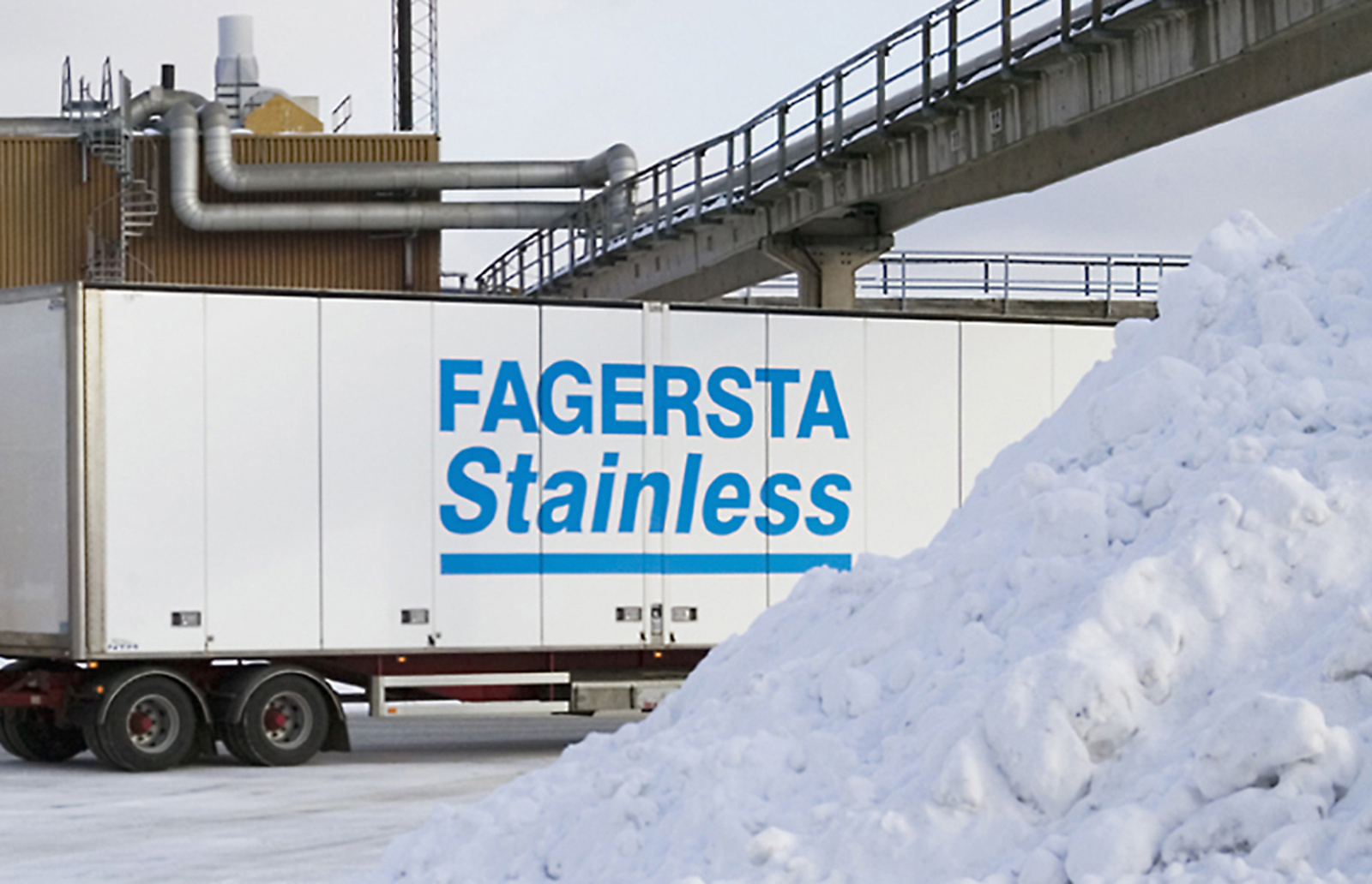
Fagersta Stainless logo
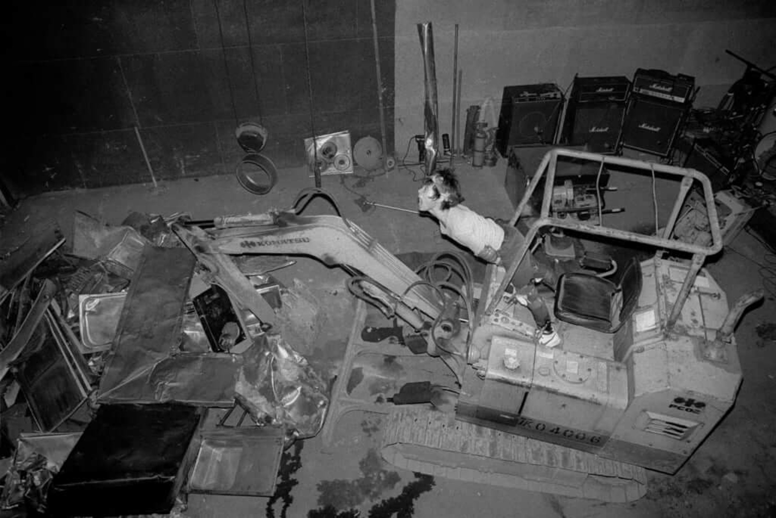
Hanatarash at the Tokyo Super Loft (1985)
Because corporations don’t own energy, or power, or hardness, it’s ours to expend and use as we see fit. During a 1985 live show Yamantaka Eye, the front man of the Japanese noise band Hanatarash drove a bulldozer through a Tokyo venue, smashing a wall and tearing up the stage. Hanatarash relied less on amplification than other noise bands and instead used physical actions and destruction tools to create ear-splitting levels of sound. But it wasn’t just any bulldozer he used. Yamantaka worked in construction and had taken the machine from his job site earlier that day. Politically, he was appalled by the luxury consumerism and glossy condos he spent his workdays building. Hanatarash took the ambient noise from the burgeoning neoliberal construction project, literally using the same tools and machines, but turned it perceptibly higher in volume and intensity than everything else around, hence making it into a powerful signal of resistance.
In 1991 the then newly-founded label Industrial Strength Records released a double-A side record with Mescalinum United and The Mover (both aliases of Marc Acardipane) and let out what was to become known as hardcore techno into the world. It was faster, louder, grittier and darker than earlier forms of techno. Mescalinum United released the EP Symphonies Of Steel Part 1 in 1993 on safety orange vinyl and in an interview with Alien Underground zine from this time Acardipane said, “Well you know I’m a machine, I’m wired up… I’m roaming the earth and it’s nice and doomy here.” Acardipane grew up in south-west Germany and experienced the simultaneous decline of the manufacturing economy and trading-fuelled financial boom in the Frankfurt region and he took on the former to refuse the latter. With pounding distorted bass drums they became machines of the night, resting during the day, forgoing productive capitalism for useless roaming—at maximum intensity nonetheless.
I’m from a losing town that must insist on its value to combat a poor reputation and disappointing first impression. Unsure of my voice, I find myself going back to the materials, metaphors, and visual styles that are known to me: signs, colors and signals from the workshop floor. A system of signals and warnings becomes the system for artistic expression. Everything is loud. But what about when the system itself is using the same heavy letters, when the robust is used to control and destroy, like when the CIA logo analogously mimics a rave, a steel plant, sci-fi? We have to determine who the good Terminator is and who is out to destroy us, by looking at the context from which they speak—if the position is one of dominance or one in need of strengthening.
The future is not set, there is no fate but what we make for ourselves. This is a manifesto for Hard Aesthetics, of the heavy and the extended with the power to transform nothing into everything; old rust into a bright yellow message.
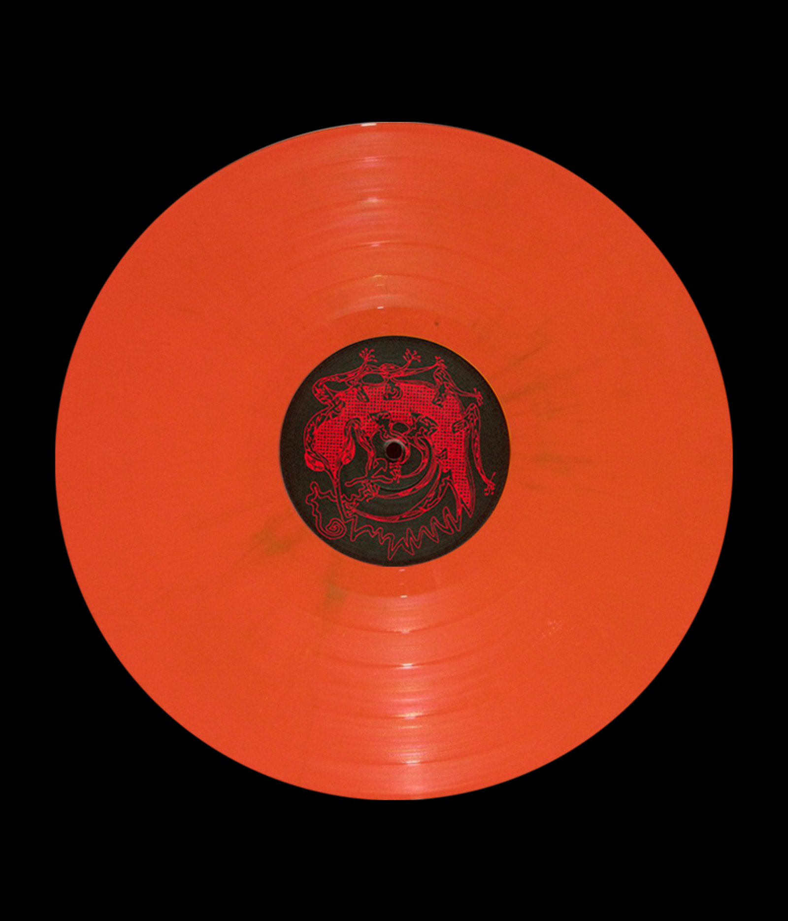
Mescalinum United, EP Symphonies Of Steel Part 1 (1993)
Fagersta Stainless by Country Music
